Header & Navigation Index
Click on any card below to navigate directly to the corresponding documentation.
Modal for creating a new patient, including scan/import options and additional details.
Redesigned search modal with integrated results grid and advanced filtering.
Redesigned profile dropdown menu with user card and updated actions.
Reorganized settings with left-side navigation, new fields, and scan settings.
Documentation for the new Patient Card layout, including the relocated bandwidth info.
Practice EHR Header - Create New Patient
Interactive GuideThis documentation covers the header and navigation components in Practice EHR. The header has been redesigned to improve workflow efficiency and user experience. Explore each section to understand the features and functionalities.
Create New Patient
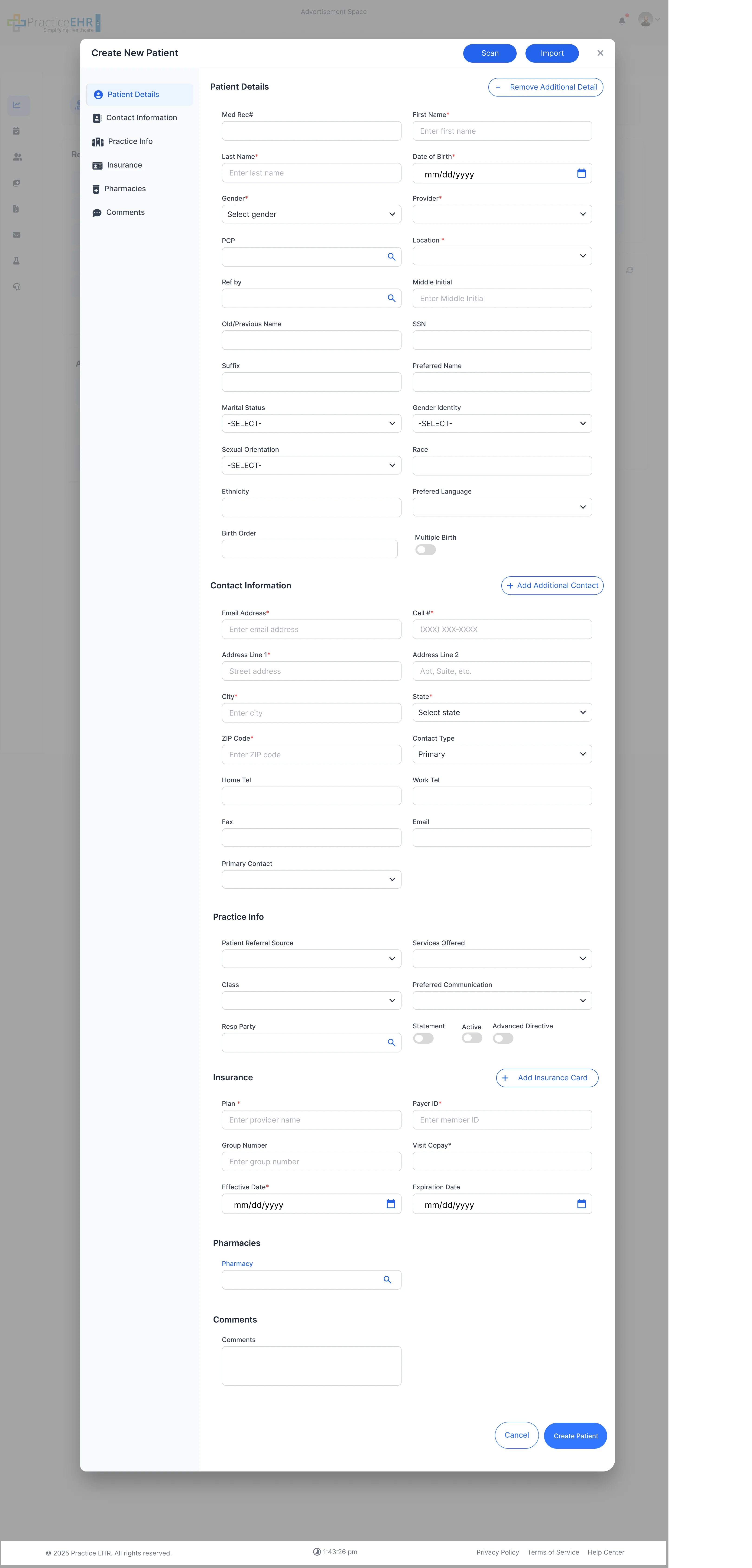
Key Features
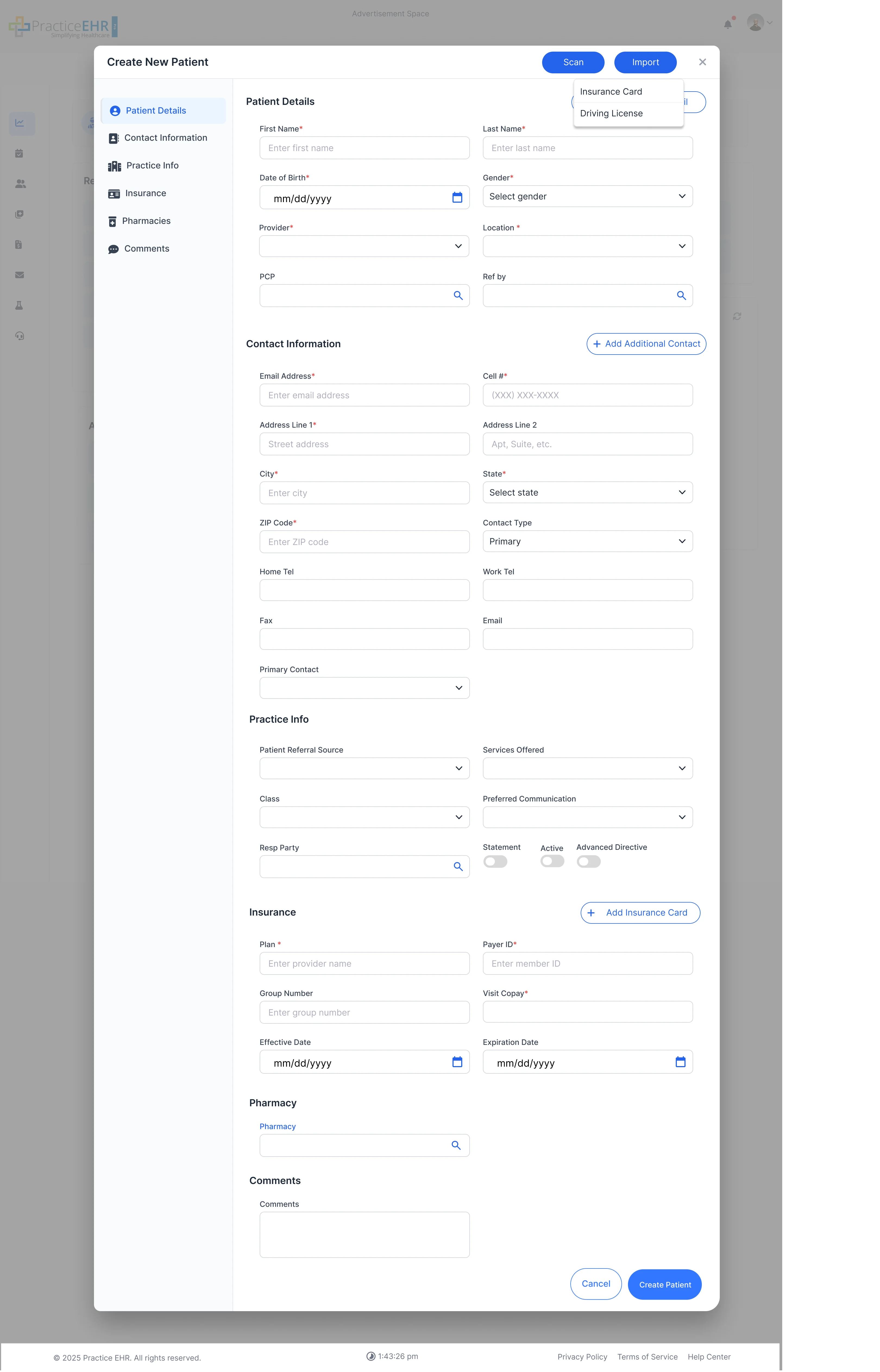
- Scan/Import Buttons: By clicking on scan and import buttons, A dropdown opens for selecting scan insurance card or driver's license or import insurance card or import driving license
- Scan/Import Options: Shortcuts that launch a modal with tabs for scanning/importing Driver's License and Insurance Card.
- Auto Update Patient Image: From import from driver license feature system will auto fetch the patient image from the driver license and update it in patient card..
Interaction Guide
- Add Additional Detail: Button expands the form to show more fields for comprehensive patient data entry.
Create New Patient (Additional Details)
Key Features
- Remove Additional Detail: Appears after extra fields are revealed. Collapses fields and switches button text back.
Interaction Guide
- Primary vs. Secondary Buttons: Create Patient (primary) runs validation and submits form. Cancel (secondary) closes without saving.
Create New Patient (Full Details View)
Patient Details Overview
- Navigation Tabs: Includes Patient Details, Contact Information, Practice Info, Insurance, Pharmacies, and Comments.
- Structured Form: Comprehensive fields for all necessary patient and visit information.
Action Items
- Scan/Import: Buttons at the top-right allow quick entry of Insurance Card or Driving License data via scan or import.
- Add Insurance: A toggle allows for adding insurance details to the record.
Dev Notes
-
Buttons
ScanandImporttrigger dropdowns for specific document types (License/Insurance). - Additional Detail button should toggle visibility of less commonly used patient fields.
Technical Details
- Form Validation: Implement comprehensive validation before submission, especially for fields marked with an asterisk (*).
- State Management: Track form state to handle "Add/Remove Additional Detail" toggle and button text changes.
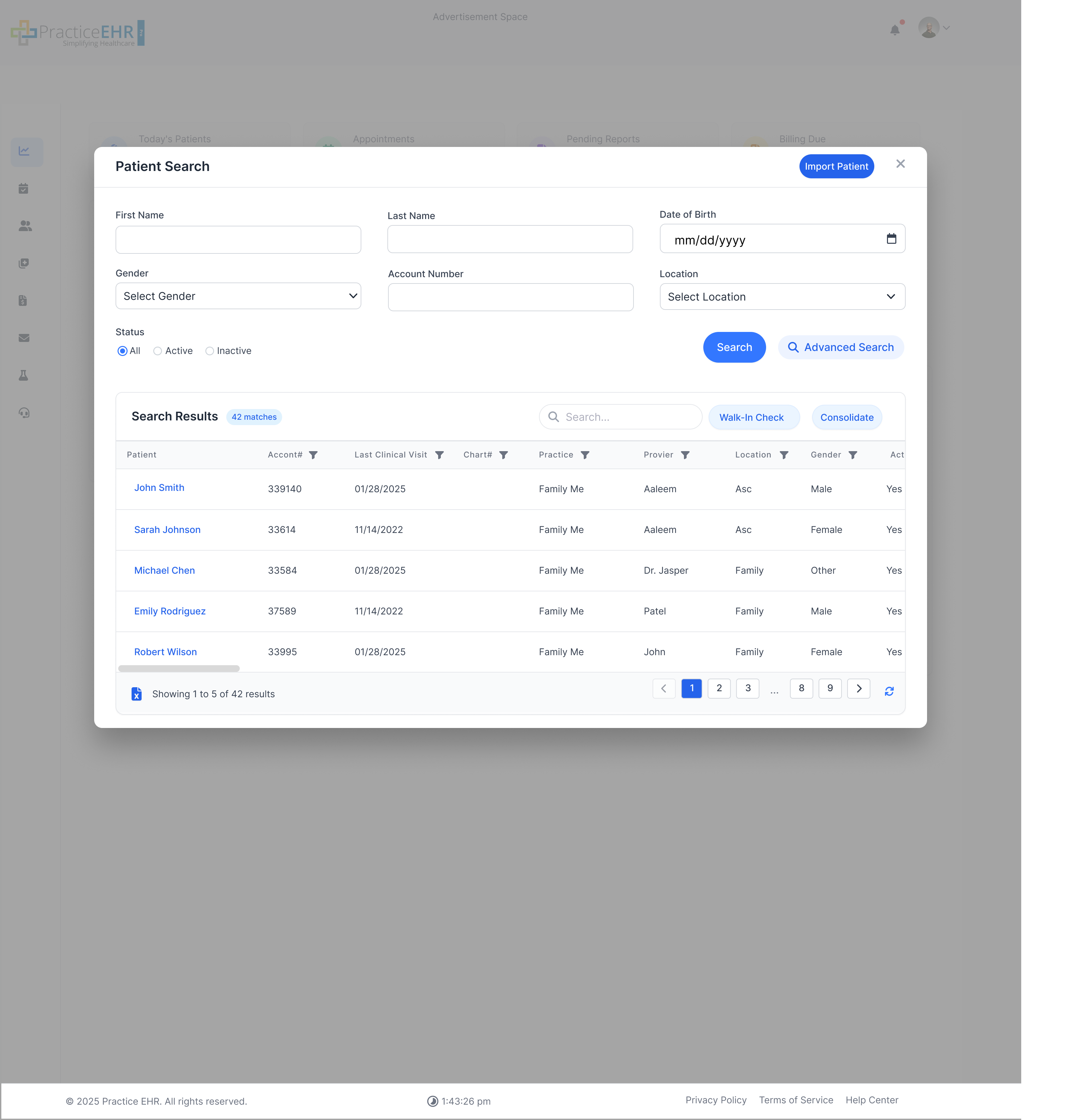
Patient Search
The patient search interface has been redesigned for better usability and efficiency. It now includes a full results grid within the same modal.
Key Features
- Search Result Pane: Full results grid shows name + avatar, last visit, practice with column filtering.
- Walk-In Check & Consolidate: Quick actions for selected rows.
Interaction Guide
- Advanced Search: Link opens extra filters in slide-down section.
- Status Radios: All/Active/Inactive filters moved up beside other filters.
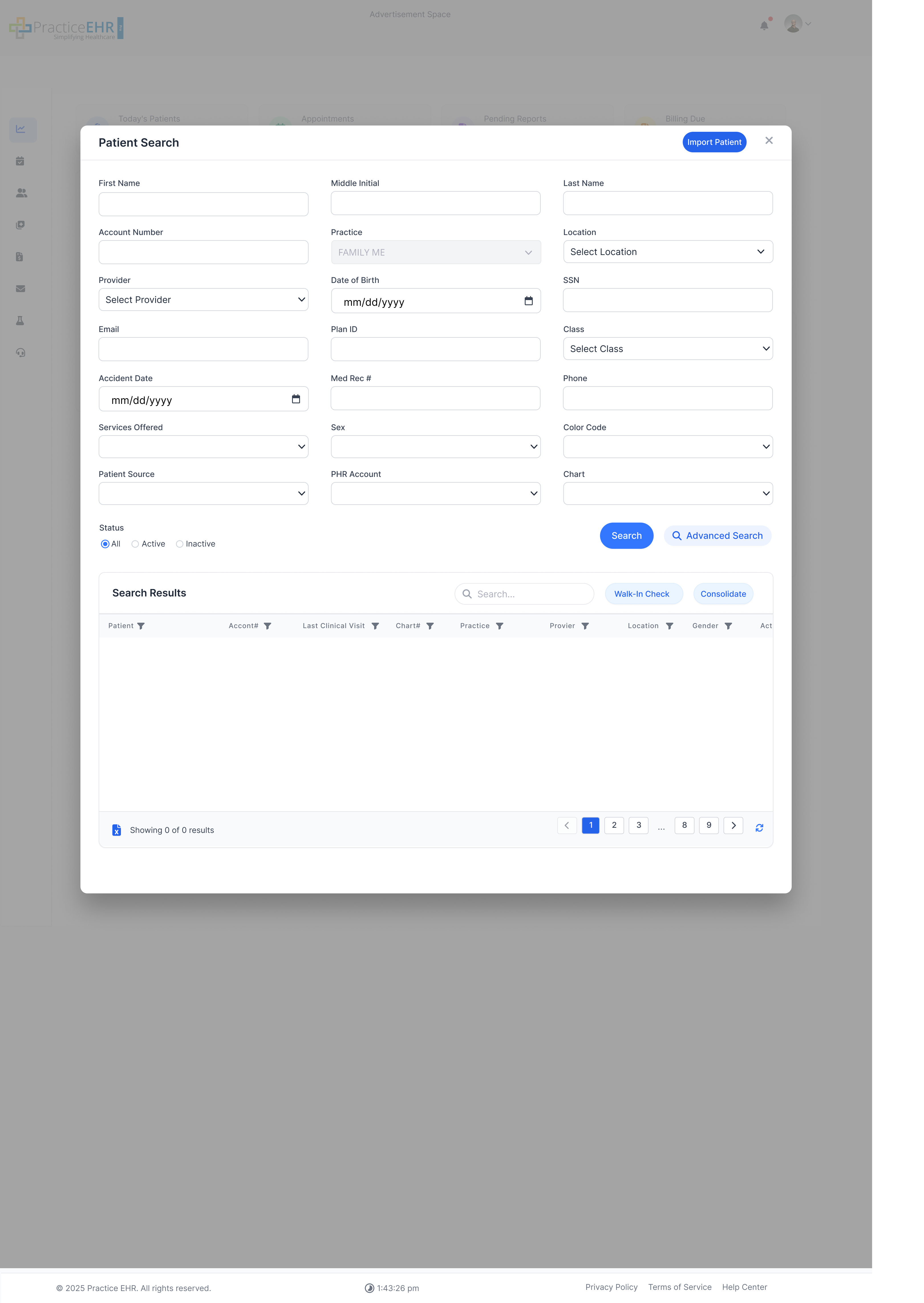
Key Features
- Advanced Search: Expanded filters for detailed patient queries.
Technical Notes
- Live Count: Display matching patient count dynamically.
Dev Notes
- Implement responsive data grid with sorting and filtering capabilities.
- Advanced search should toggle visibility of additional fields as shown below.
Technical Details
- Status Radio Button: Radio buttons for filtering search by All, Active, and Inactive status.
Profile Icon
The profile dropdown has been completely redesigned with a new profile card and refreshed icon styles.

Key Features
- Profile Card: Shows user's avatar, full name, and email at the top.
- Menu Options: Clear icons and labels for actions like My Profile, Settings, Lock, Logout.
UI Changes
- Spacing & Card Look: Wider padding, rounded corners, subtle shadow.
- Icons: Updated FontAwesome icons for a modern look.
Dev Notes
- Fetch and display current user data (avatar, name, email) in the profile card.
- Ensure menu items correctly link to their respective actions/pages.
Technical Details
- Dropdown Positioning: Ensure proper alignment below the profile icon on various screen sizes.
- State Handling: Manage dropdown open/close state effectively.
Settings Modal
The settings interface has been reorganized with a left-side navigation and new fields for better usability.
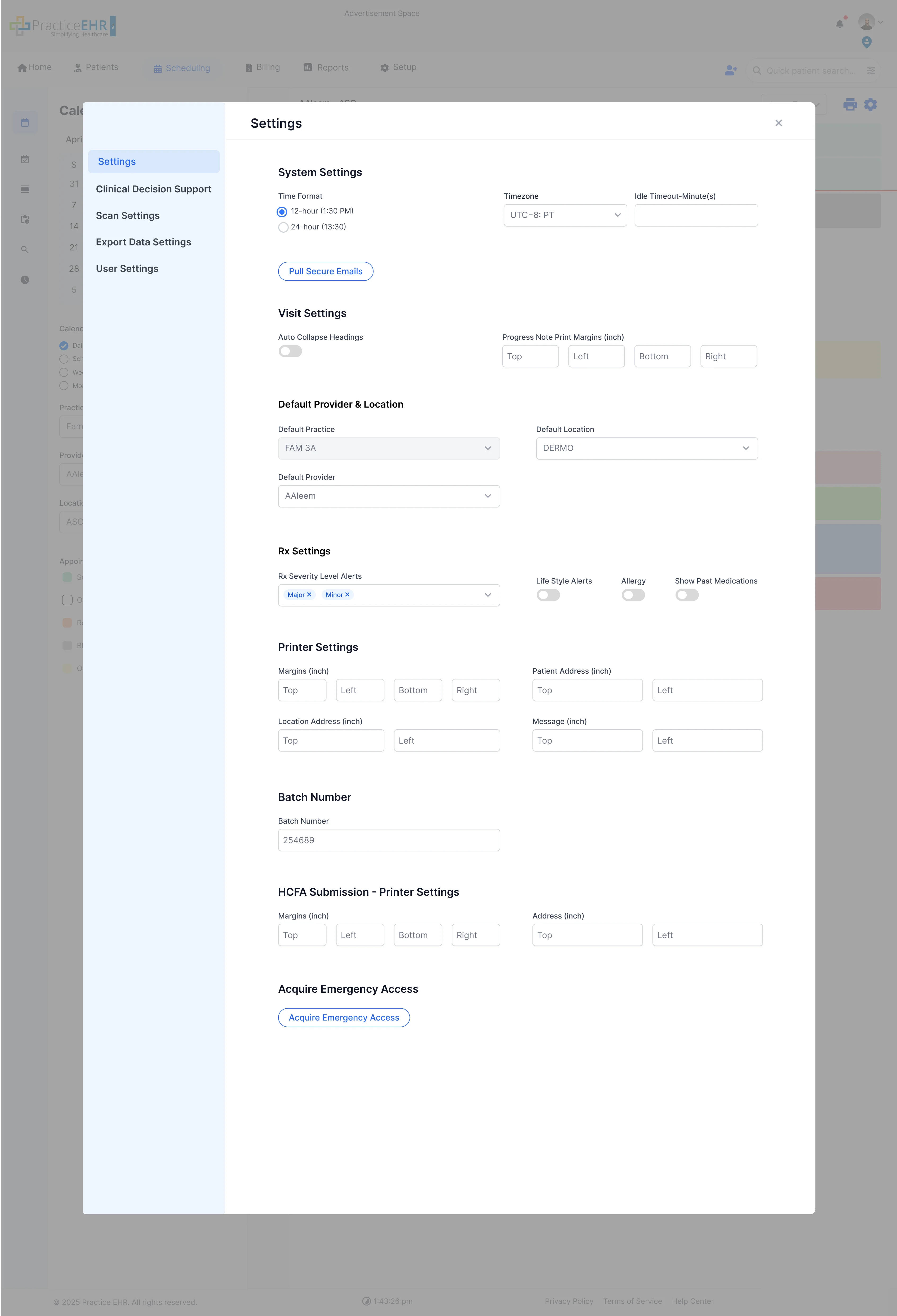
Key Features
- Left-Side Navigation: Replaces old top tabs with vertical list for better organization.
- New Fields: Time Format radio and Timezone dropdown added.
UI Changes
- Rx Severity Level Alerts: Changed from checkboxes to multi selection dropdown.
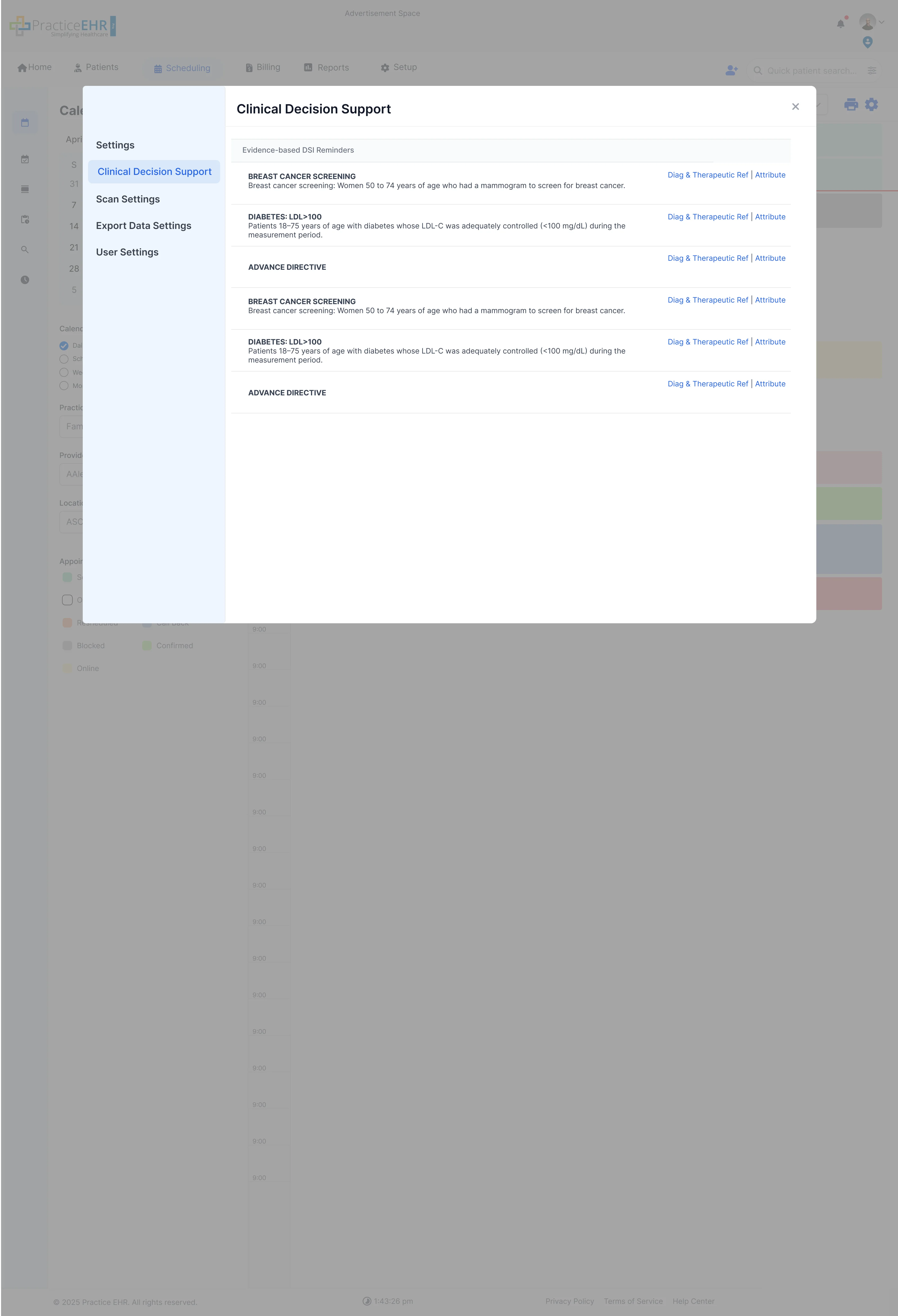
Key Features
- Left-Side Menu: Consistent with other settings screens.
- DSI Reminders: Restyled with clean white rows and slim separators.
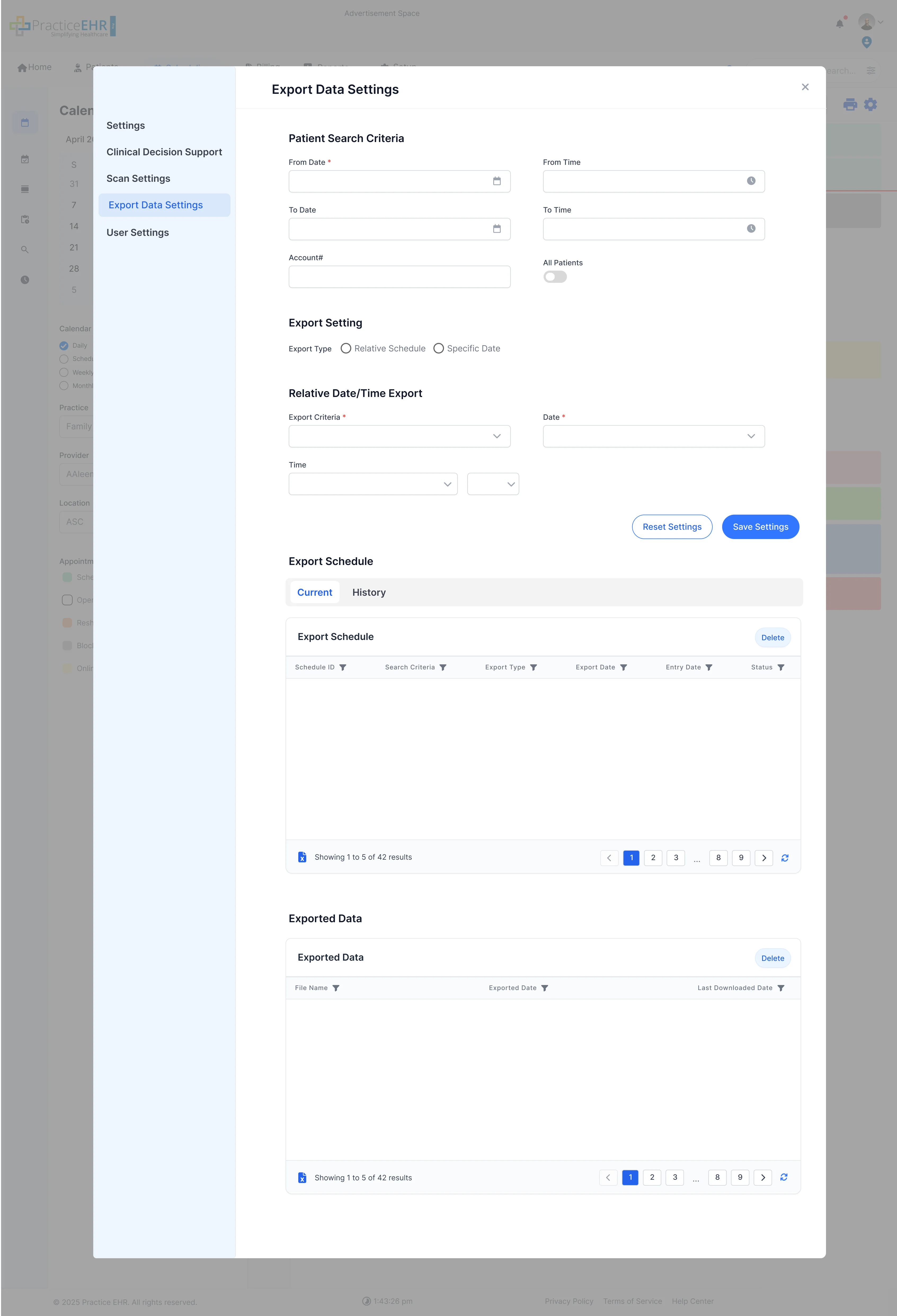
Key Features
- Left-Side Menu: Consistent with other settings screens.
- Export Settings Restyled with clean white rows and slim separators. UI of Export data settings
Interaction Guide
- Row Actions: Now show as small blue hyperlinks instead of full buttons.
- Navigation: Click menu items to switch between settings sections.
Scan Settings
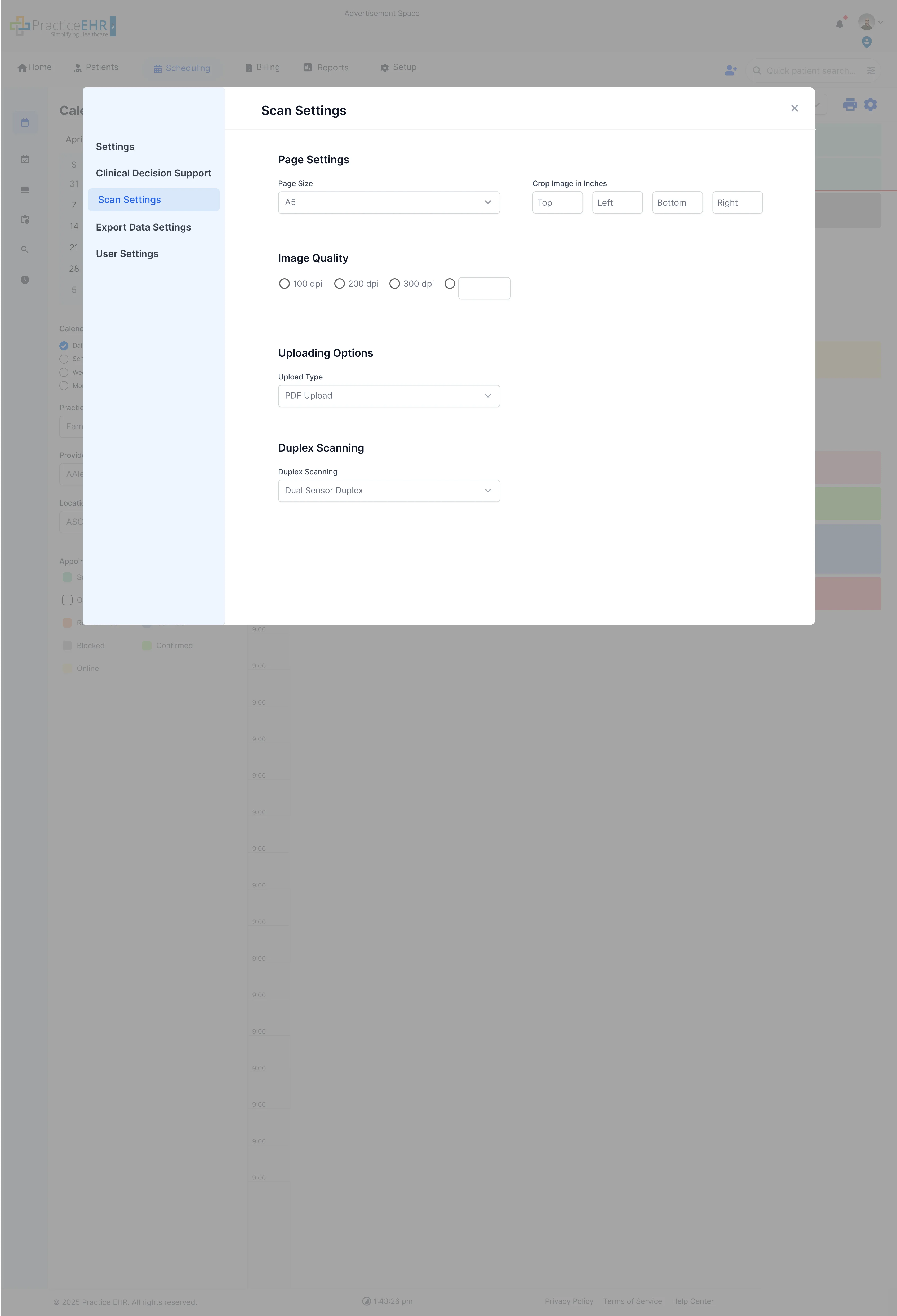
Key Features
- Left-Side Menu: Consistent navigation across all settings.
- Duplex Scanning: Changed from radio buttons to single dropdown.
- Scan Settings: Options for scan source, resolution, mode, pixel type, and duplex scanning.
UI Improvements
- Compact Inputs: More efficient use of space with dropdowns and selects.
- Equal Spacing: Better visual hierarchy and readability between settings.
Dev Notes
- Implement consistent left-side navigation logic to show/hide relevant content panes.
- Ensure settings are saved correctly when the user clicks 'Save' or navigates away.
Technical Details
- Time Zone and Time Format: These are new fields added in the "Preferences" section of the Settings UI.
- Component Reusability: Consider using reusable components for dropdowns and input fields across settings sections.
Patient Card Overview
This section documents the new Patient Card component, which prominently features patient details and status information.
Bandwidth Status in Patient Card
The **Bandwidth Status** has been moved from the footer to the Patient Card for immediate visibility when viewing a patient's record. This ensures that users are always aware of the system load impacting their current session.
Relocated Feature
- Bandwidth Indicator: Displayed within the card, often next to the patient's name or status.
Design Rationale
- Contextual Awareness: Placing the bandwidth status here makes its state immediately visible to the user during the primary workflow.
Dev Notes
- The bandwidth value must be dynamically updated based.