Phase 1
UI Standards/Components
Quick access to all of the tabs and sections of the New UI Screens.
Dashboard & Indicators
Cards and at-a-glance metrics
Navigation
Move across screens and sections
Inputs
Forms, selectors, pickers
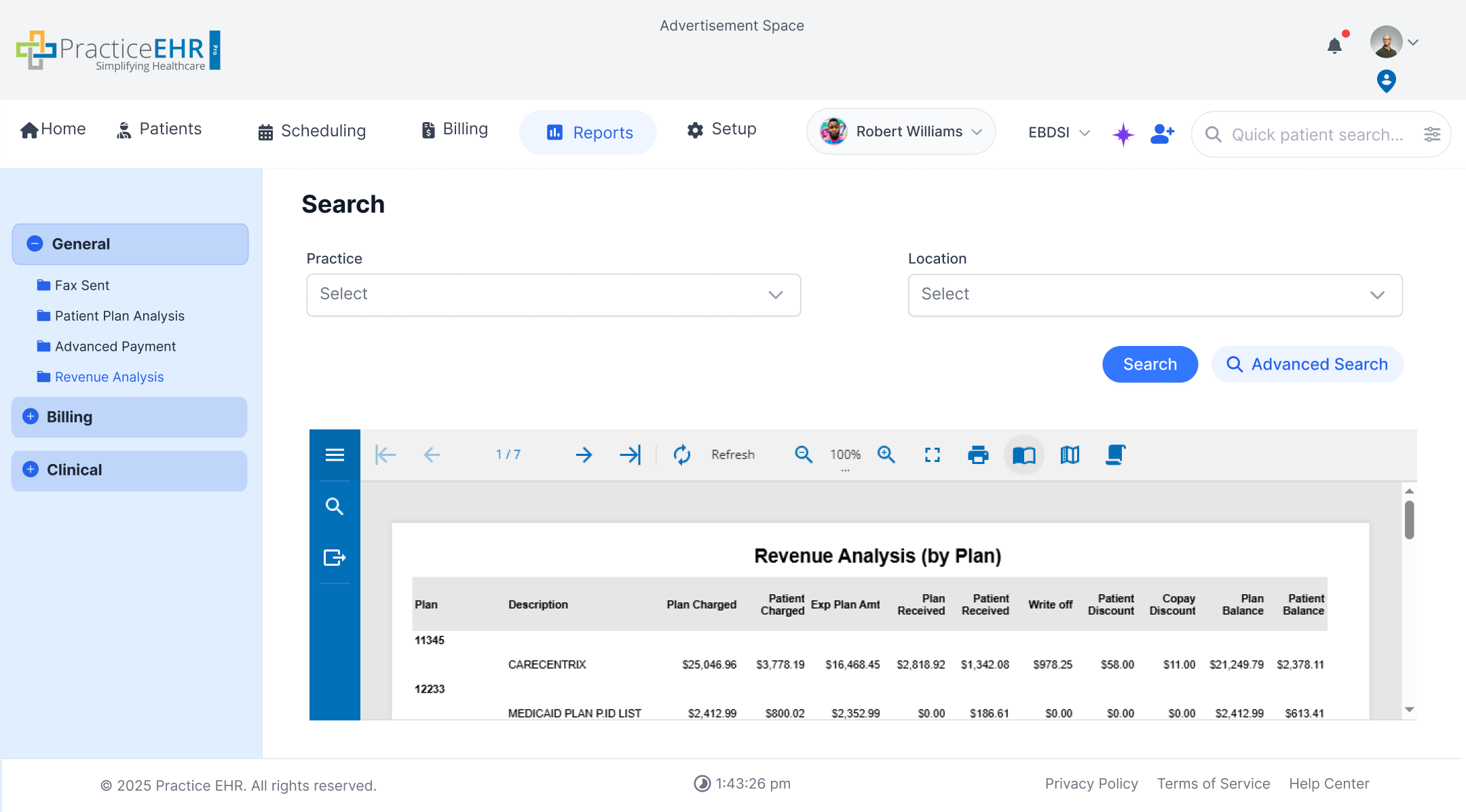
Grids
Grid types and filtering
- Grid Filters
- Scroll Behavior
- Row Drag & Drop
- Advanced Search Collapse
- Home Grids
- Auto Search Grids
- Optional Auto Search Grids
- Manual Search Grids
- Grids with Pre-defined Filters
- Active Report Grids
- Inline Editors (Due Date / Assigned To)
Grid Behaviors
-
All grids include a search bar.
-
Click a column name to sort; click again to flip ascending / descending. The arrow only appears on the active column. See example
-
Any grid that exposes a Due Date or Assigned To column is inline-editable — pick a date from the calendar popover or pick a teammate from the typeahead. See spec
Advanced
AI elements and special controls
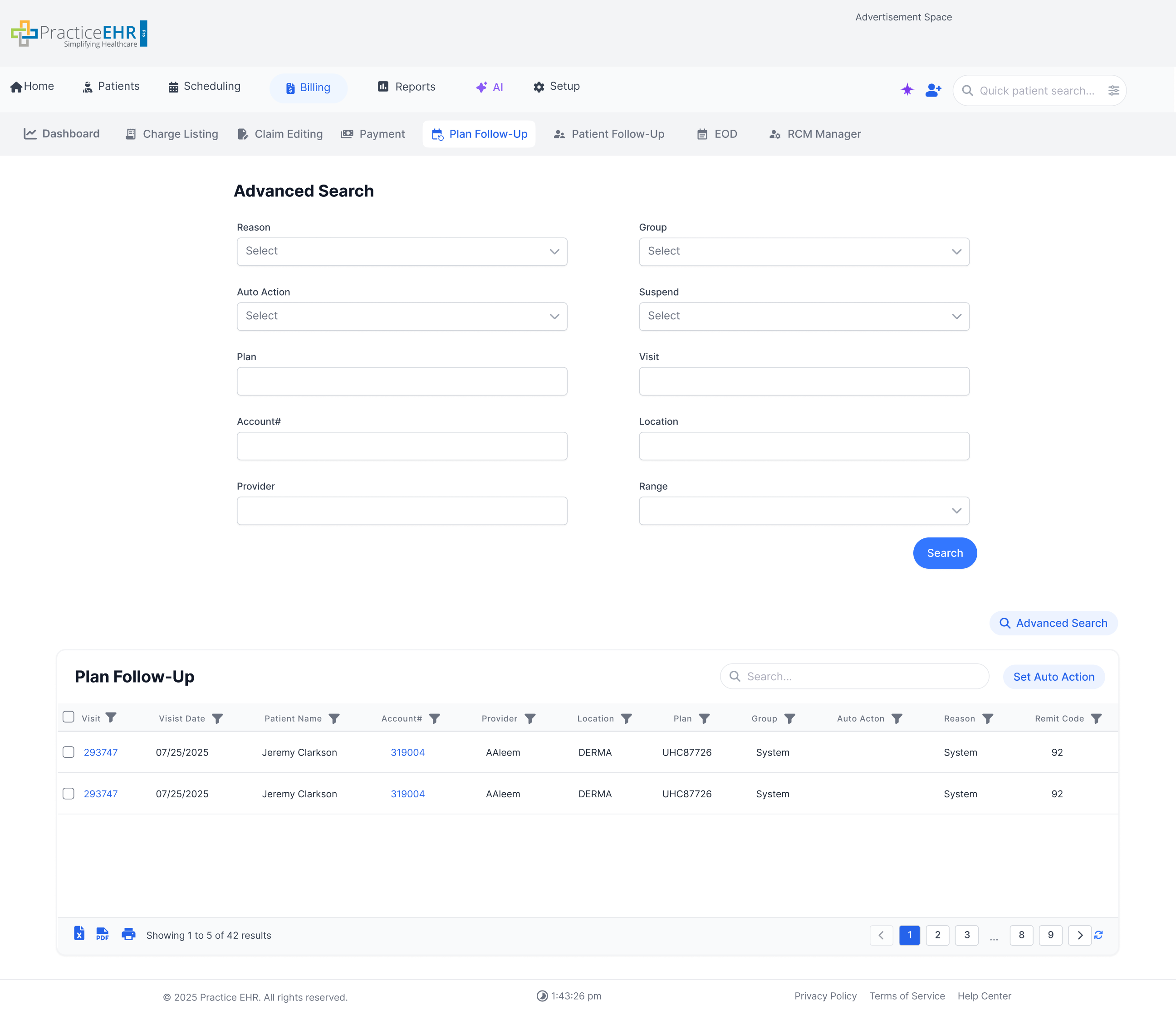
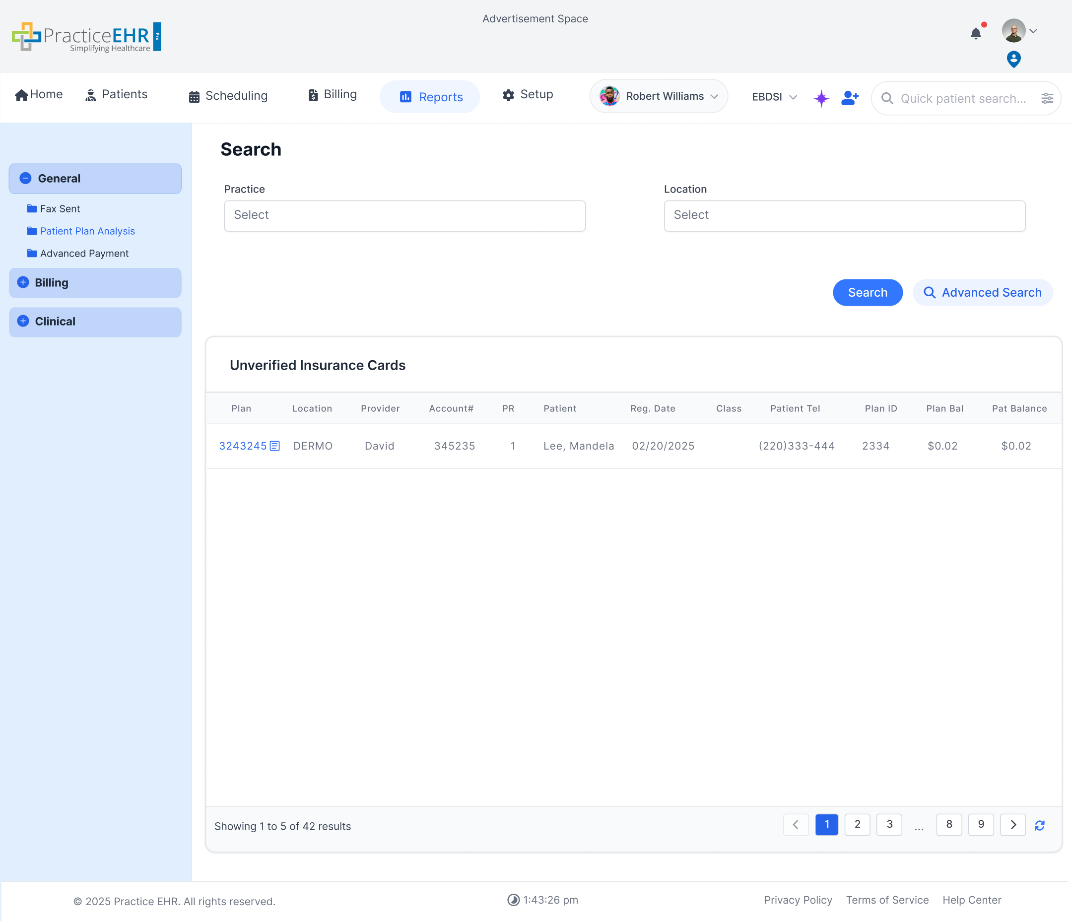
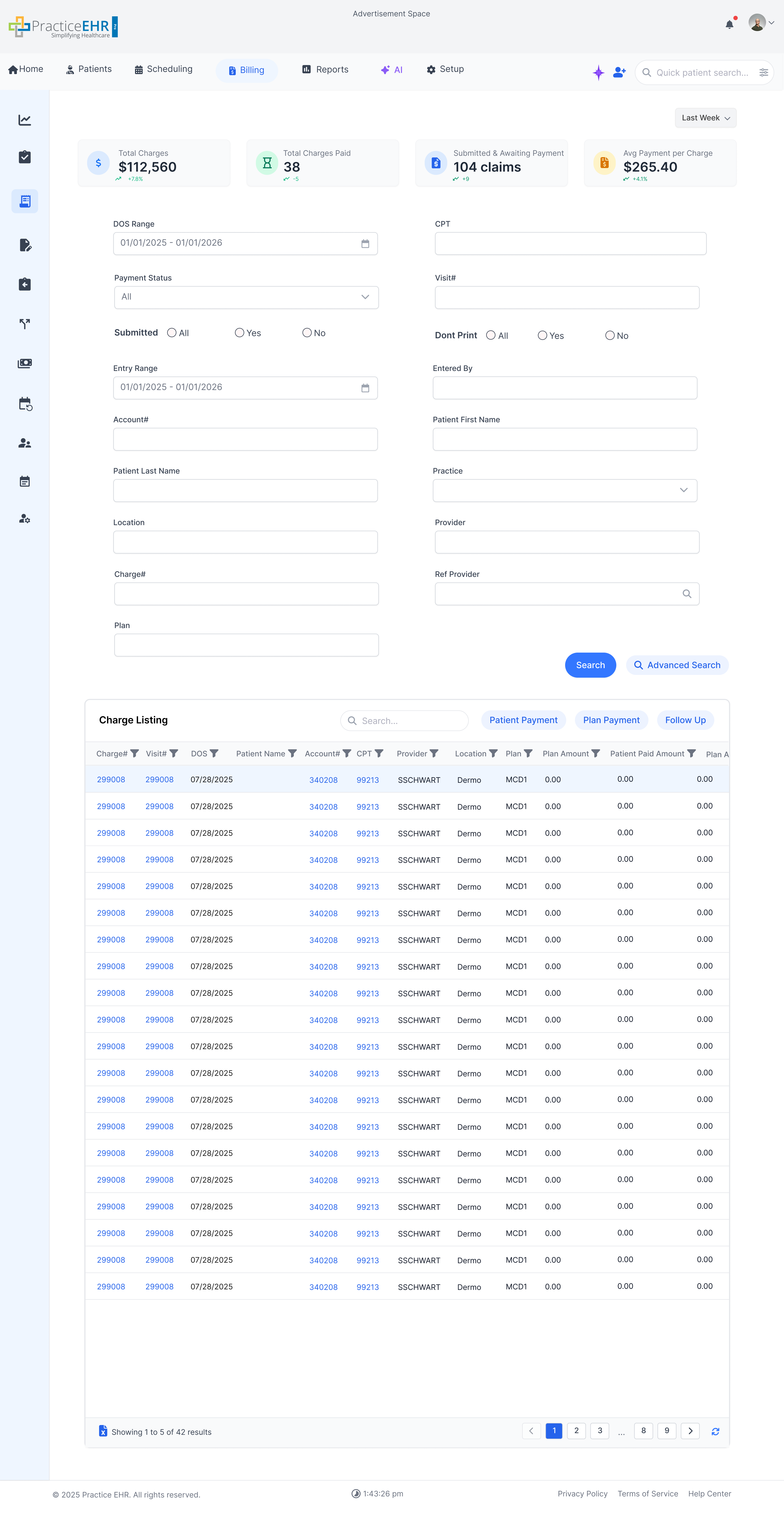
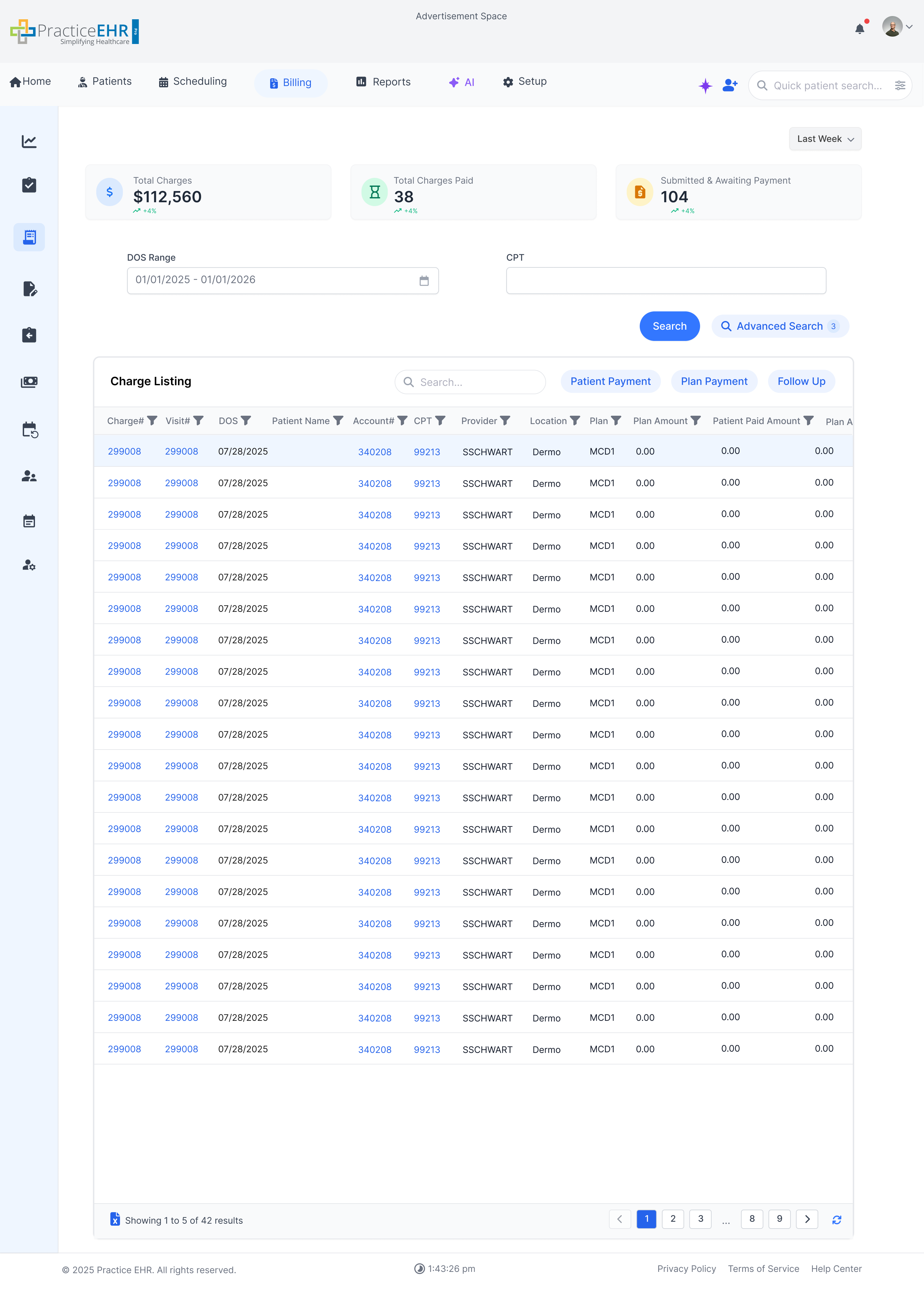
Advanced Search
Interactive GuideAdvanced Search supports two UI types. Both types use the same behavior: users open Advanced Search to view additional criteria, then click Search. After Search, the criteria collapses and the Advanced Search button shows the applied filter count.
Grid action button sizing: both Search and Advanced Search buttons in this pattern should use 29px height with 12px text at 400 weight.
Type 1 Advanced Search Only (Button First)
Type 1In Type 1, there are no visible fields by defaultonly an Advanced Search button. Clicking it reveals the fields and the Search button. After the user clicks Search, the panel collapses and the Advanced Search button shows the filter count (e.g., “Advanced Search (3)”).
Before
No criteria fields visible. Only the Advanced Search button is shown.

After
Clicking Advanced Search reveals fields and the Search button. After Search, the criteria collapses and the count appears on the Advanced Search button.

Type 1: Key Rules
-
Default view shows only the Advanced Search button.
-
Clicking Advanced Search reveals all criteria fields + Search.
-
Click Search to apply filters and refresh results.
-
After Search, the panel collapses and Advanced Search shows the applied filter count.
Interaction Summary
- Start with only Advanced Search.
- Click Advanced Search to reveal criteria + Search.
- Select filters and click Search.
- Collapse criteria + show count on Advanced Search.
Type 2 Basic Fields + Advanced Search (Hybrid)
Type 2In Type 2, the screen shows basic search fields with both Search and Advanced Search buttons. Clicking Advanced Search reveals additional fields. After the user clicks Search, the criteria collapses and the Advanced Search button shows the applied filter count.
KPI rule (Type 2): When KPI cards are displayed on the screen, only two fields remain visible by default; all other fields move under Advanced Search.
Before
Basic fields are visible with both Search and Advanced Search. (Additional fields remain hidden.)

After
After clicking Advanced Search, more fields appear. After clicking Search, the panel collapses and the Advanced Search button shows the count.
Type 2: Key Rules
-
Default view shows basic fields + Search + Advanced Search.
-
If KPI cards are visible, only two fields stay on screen; the rest move under Advanced Search.
-
Clicking Advanced Search reveals additional fields.
-
Click Search to apply filters and refresh results.
-
After Search, the criteria panel collapses to save space.
-
Advanced Search shows the applied filter count after Search (e.g., “Advanced Search (3)”).
Interaction Summary
- Start with basic fields + Search + Advanced Search.
- Click Advanced Search to reveal more fields.
- Select filters and click Search.
- Collapse criteria + show filter count on Advanced Search.
Advanced Search Action Specifications
| Action | Property | Value | Notes |
|---|---|---|---|
| Search Button | Height | 29px | Use the compact search-action height from the sizing note above in both Type 1 and Type 2 layouts. |
| Typography | 12px / 400 | Keep the Search label compact and consistent with the Advanced Search action. | |
| Advanced Search Button | Height | 29px | Match the Search button height exactly in this pattern. |
| Typography | 12px / 400 | Use the same compact label treatment when the panel is collapsed or expanded. | |
| Applied Filter Count | Same measurements | Showing the active-filter count changes text only; the control keeps the same metrics. |
Action Cards
InteractiveAction Cards are clickable content blocks used to highlight grouped, billing-related or workflow-specific actions, such as pending encounters, follow-up tasks, or submissions. These cards visually prioritize content using color-coded icons and numbers, allowing users to quickly assess tasks that require attention.
Typography: action-card message text should use 13px type at 500 weight.
2 Electronic encounters are on hold for review
2 Electronic encounters are on hold for review
5519 Electronic encounters are not billed since last 2+ days
2 Clearinghouse Rejection(s), need to be reviewed
92 Visit(s) need to be fixed before submission
1094 Visit(s) in plan follow up bucket
243 ERA/Check need posting
236 Visit(s) in patient follow up bucket
12 Prior Auth(s) pending
552 Paper visit(s) to be submitted
Action Cards UI Specifications
| Element | Property | Value | Notes |
|---|---|---|---|
| Card Container | Dimensions (W x H) | Responsive width x 80px min height | 2-column layout on desktop, single column on mobile. |
| Fill (Background) | #FFFFFF (100%) | Solid white background. | |
| Corner Radius | 8px | Applies to all four corners. | |
| Auto Layout | Flow / Direction | Horizontal | Content flows from left to right. |
| Padding (Internal) | 16px (Left/Right), 12px (Top/Bottom) | Space from the edge to the content. | |
| Gap (Internal) | 12px | Horizontal space between items inside the card. | |
| Content Label | Typography | 13px / 500 | Apply to the action-card message text in every card variant. |
| Appearance | Stroke (Border) | 1px, #F2D48A (warning) / #D1D5DB (neutral) | Warning cards use yellow border; follow-up cards use neutral gray. |
| Effects | None | Updated cards use flat style without shadow. | |
| Grid | Spacing (External) | 12px | Gutter space *between* action cards in a list. |
| Colors | Selection Palette | #1D4ED8, #D1D5DB, #F2D48A, #059669... | Updated palette for warning, follow-up, and success variants. |
Alert Messages
InteractiveAlerts notify users about important workflow states. The component now supports success, error, warning, information, schedule-conflict, and long-message error states using the updated Figma layout and content.
Error
Warning
Information
Cannot Create Schedule
Following slots have conflicts
6/30/2025 - 6/31/2025
08:00AM - 05:00 AM
6/30/2025
08:00AM - 05:00 AM
Multi-line Error Message
Multi Line Error
PEHR Window Placement
Advertisement Space
Practice EHR
Home
Patients
Scheduling
Billing
Reports
AI
Practice
Provider
Location
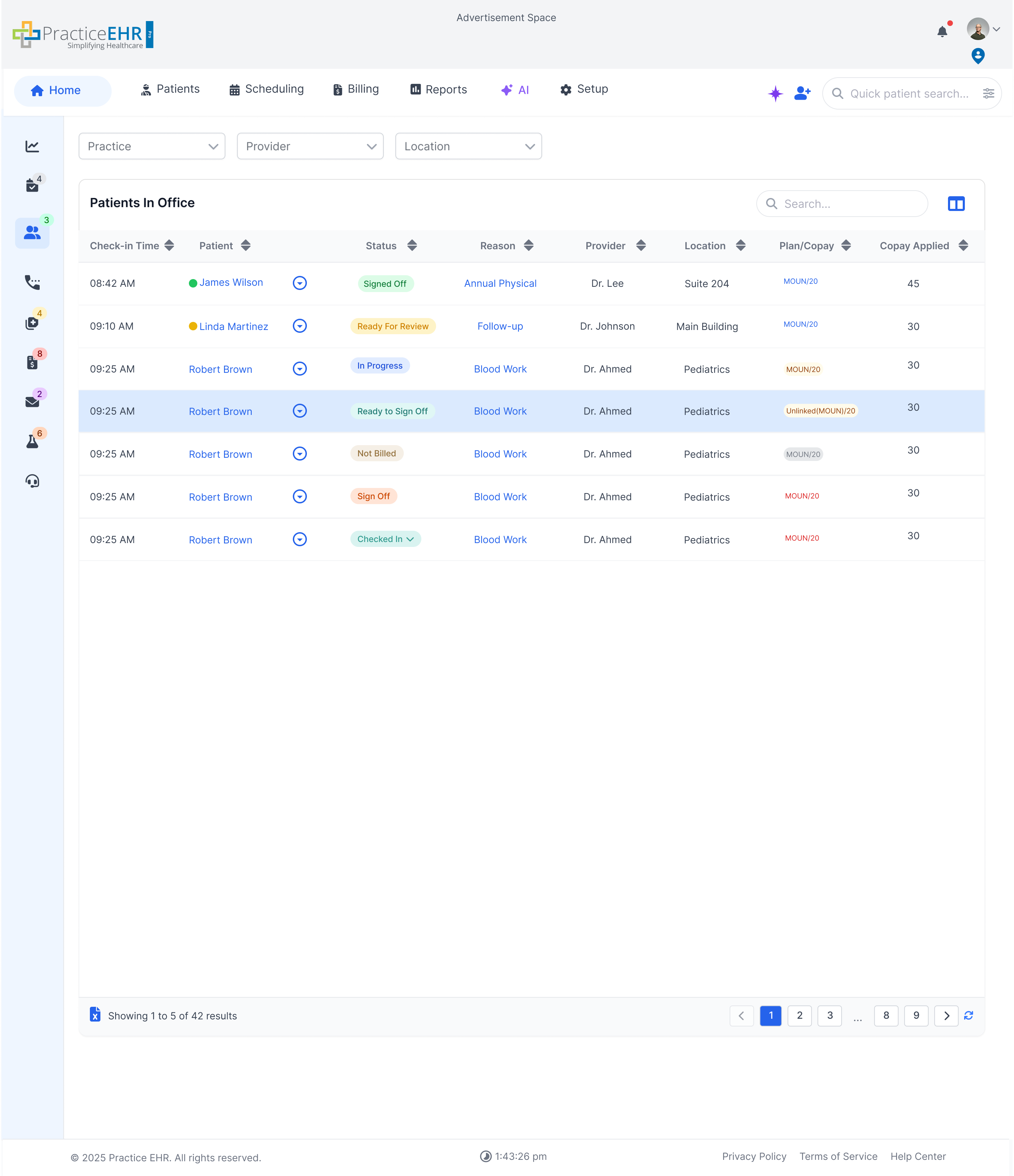
Not Billed Encounters
Search
Visit DatePatientChief ComplaintStatusProviderLocationPlanComments
08:42 AMJames WilsonChief ComplaintNot BilledDr. LeeSuite 204PPO/ $2045
09:10 AMLinda MartinezEncounterNot BilledDr. JohnsonMain BuildingMedicaid/$2030
09:25 AMRobert BrownBack PainIn ProgressDr. AhmedPediatrics(MOUN/20)30
Multi Line Error
Alert UI Specifications
| Alert Type | Property | Value | Notes |
|---|---|---|---|
| Success | Dimensions (W x H) | 529px x 83px | Node `3138:4017`. |
| Surface | BG `#E6F4EA`, border `1px rgba(0,0,0,0.1)`, radius `6px` | Flat surface to match the Figma component. | |
| Typography | Title `16/600 #22C55E`, Message `14/400 rgba(0,0,0,0.56)` | Leading check icon is `20px`. | |
| Close Icon | 24px, color `#22C55E`, top/right `10px` | Single close control only. | |
| Showcase BG | Transparent | Gray container background removed. | |
| Error | Dimensions (W x H) | 529px x 118px | Node `3138:4106`. |
| Surface | BG `#FDEAEA`, border `1px rgba(0,0,0,0.1)`, radius `6px` | Same shared card shadow token. | |
| Typography | Title `16/600 #EF4444`, Message `14/400 rgba(0,0,0,0.56)` | Leading error icon size `20px`. | |
| Actions | Buttons `34px` high; `Dismiss` `85.328px`, `Fix Issue` `91px` | Actions appear in the Figma order: secondary first, primary second. | |
| Close/Icon Color | `#EF4444` | Close icon is 24px. | |
| Warning | Dimensions (W x H) | 529px x 118px | Node `3138:4130`. |
| Surface | BG `#FFF8E1`, border `1px rgba(0,0,0,0.1)`, radius `6px` | Close icon color `#F59E0B`. | |
| Typography | Title `16/600 #F59E0B`, Message `14/400 rgba(0,0,0,0.56)` | Leading warning icon size `20px`. | |
| Actions | Buttons `34px` high; `Update Insurance` `154px`, `Remind Later` `126px` | Pill radius `999px`. | |
| Primary Accent | `#F59E0B` | Matches icon/title/primary action. | |
| Information | Dimensions (W x H) | 529px x 118px | Node `3138:4176`. |
| Surface | BG `#EAF4FD`, border `1px rgba(0,0,0,0.1)`, radius `6px` | Close icon color `#0EA5E9`. | |
| Typography | Title `16/600 #0EA5E9`, Message `14/400 rgba(0,0,0,0.56)` | Leading info icon size `20px`. | |
| Actions | Buttons `34px` high; `Later` `104px`, `Update Now` `126px` | Pill radius `999px`. | |
| Primary Accent | `#0EA5E9` | Matches icon/title/primary action. | |
| Cannot Create Schedule | Dimensions (W x H) | 529px x 219px | Node `3138:4608`. |
| Typography | Title `16/600 #EF4444`, body/label `14/400 rgba(0,0,0,0.56)` | Leading error icon `20px`; close icon `24px`. | |
| Conflict Fields | Date fields `202x42`, time fields `186x42`, border `#D1D5DB`, radius `6px` | Field text `16px #6B7280`, subtle field shadow `0 1px 2px rgba(0,0,0,0.05)`. | |
| Divider | `1x96` at x `471`, color `#D1D5DB` | Right-side vertical divider in conflict area. | |
| Multi Line Error | Dimensions | Full-width container, PEHR preview max `1254px`, min-height `200px` | Matches node `11684:6614` and the PEHR window placement. |
| Text Wrapping | Message width up to `1157px`, line-height `24px` | Long copy wraps before the action row. | |
| Actions | `Dismiss` followed by `Fix Issue`, both `34px` high | Action row stays under the wrapped message. | |
| Placement | Centered at top `22px` inside the PEHR shell | Overlay width is `calc(100% - 186px)` with max `1254px`. |
Breadcrumbs
NavigationBreadcrumbs show the user's current location on a page and how they got there. Each part is clickable so users can jump backward. It's like a mini navigation path.
Interactive Example
Click on any part of the breadcrumb to navigate back to that section.
Dashboard
Patients
John Doe
Medical History
Breadcrumb Specifications
| Element Name | Description | Dimensions (WH) | Style / Notes |
|---|---|---|---|
| Breadcrumb Container | The main auto-layout container holding all links and separators. | Hug Content 18px (Hug) | Layout: Horizontal, Padding: 0px, Corner Radius: 0px. |
| Internal Spacing | Space between each item (link, separator) in the trail. | 16px | Set as "Gap" in Auto Layout. |
| Link Text / Icon (Active) | A clickable navigation link or icon in the path. | (Height ~18px) | Color: #3377FF |
| Current Page Text (Inactive) | The non-clickable text for the current page. | (Height ~18px) | Color: #6B7280 |
Buttons
InteractiveButtons are used for actions. Choose the correct type based on importance and context of the task.
Primary Buttons
Main actions like "Save" or "Submit" with bold white text on a colored background.
Primary Button Specifications
| Element / Group | Property | Value | Style / Notes |
|---|---|---|---|
| Sizing | Resizing (Width) | Hug | Width adjusts to content (e.g., 187px instance). |
| Height | 29px | Fixed height. | |
| Typography | Font Size | 12px | Compact primary label size. |
| Font Weight | 400 | Regular weight. | |
| Appearance | Corner Radius | 9999px | Results in a fully-rounded "pill" shape. |
| Fill (Background) | #3377FF | Solid primary blue. | |
| Stroke (Border) | None (Weight: 0) | No visible border. |
Secondary Buttons
Less critical actions like "Cancel". White background with a border and colored text.
Specifications
| Element / Group | Property | Value | Style / Notes |
|---|---|---|---|
| Sizing | Resizing (Width) | Hug | Width adjusts to content. |
| Height | 29px | Fixed height. | |
| Typography | Font Size | 12px | Compact secondary label size. |
| Font Weight | 400 | Regular weight. | |
| Appearance | Corner Radius | 9999px | Results in a fully-rounded "pill" shape. |
| Fill (Background) | #FFFFFF | Solid white. | |
| Stroke (Border) | 1px, Inside, #3377FF | 1px solid blue border. | |
| Text/Icon Color | #2563EB or #3377FF | Inferred from selection/border colors. |
Tertiary / Ghost Buttons
Minor actions like "Advanced Search". Light backgrounds and soft colors.
Tertiary Button Specifications
| Element / Group | Property | Value | Style / Notes |
|---|---|---|---|
| Sizing | Resizing (Width) | Hug | Width adjusts to content. |
| Height | 27px | Fixed height. | |
| Typography | Font Size | 12px | Compact tertiary label size. |
| Font Weight | 400 | Regular weight. | |
| Appearance | Corner Radius | 9999px | Results in a fully-rounded "pill" shape. |
| Fill (Background) | #EDF3FF | Solid light blue. | |
| Stroke (Border) | 1px, Inside, #E2E8F0 | 1px light gray border. | |
| Text/Icon Color | #2563EB | Inferred from selection colors. |
Pill Buttons
Used for filtering/tagging. Color-coded background with full rounded appearance.
Pill Button Specifications
| Element / Group | Property | Value | Style / Notes |
|---|---|---|---|
| Base Sizing | Width | Hug Content | Width adjusts to content. |
| Height | Hug Content (e.g., 21px) | Height adjusts to content. | |
| Base Auto Layout | Flow | Horizontal | Content flows left-to-right. |
| Padding | 10px (L/R), 3px (T/B) | Internal spacing from edge. | |
| Gap | 10px | Space between internal items. | |
| Base Appearance | Corner Radius | 9999px | Results in a fully-rounded "pill" shape. |
| External Spacing | 20px | Space between pills in a group. | |
| Variants (Examples) | Active Patients | Fill: #E0F2FE | Light blue background. |
| Completed | Fill: #DCFCE7 | Light green background. | |
| Pending Review | Fill: #FEF3C7 | Light yellow background. | |
| All Records | Fill: #F3F4F6 | Light gray background. |
Checkboxes
Multi-selectCheckboxes allow users to select one or more options. Use them when multiple selections are allowed in a group.
Basic Checkboxes
Basic unchecked checkbox
Indicates item is selected
Cannot be clicked
Selected but locked from changes
Checkbox with Label
You agree to our Terms of Service and Privacy Policy
Receive updates and promotions
Checkbox Groups
Vertical Layout
Horizontal Layout
Checkbox Specifications
| State | Property | Value | Notes |
|---|---|---|---|
| Default | Dimensions (WH) | 20px 20px | Fixed size. |
| Corner Radius | 4px | Slightly rounded corners. | |
| Fill (Background) | #FFFFFF | Solid white. | |
| Stroke (Border) | #6B7280 | Default gray border. | |
| Checked | Dimensions (WH) | 20px 20px | Fixed size. |
| Corner Radius | 4px | Slightly rounded corners. | |
| Fill (Background) | #0075FF | Solid blue. | |
| Stroke (Border) | None (Weight: 0) | No border. | |
| Hovered (Default) | Dimensions (WH) | 20px 20px | Fixed size. |
| Corner Radius | 4px | Slightly rounded corners. | |
| Fill (Background) | #FFFFFF | Solid white. | |
| Stroke (Border) | 2px, Inside, EHR Blue | Thicker blue border on hover. | |
| Hovered (Checked) | Dimensions (WH) | 20px 20px | Fixed size. |
| Corner Radius | 4px | Slightly rounded corners. | |
| Fill (Background) | #0075FF | Solid blue. | |
| Stroke (Border) | 1px, Inside, #6B7280 | Gray border appears on hover. | |
| Disabled (Default) | Dimensions (WH) | 20px 20px | Fixed size. |
| Corner Radius | 4px | Slightly rounded corners. | |
| Fill (Background) | #6B7280 | Solid gray. | |
| Opacity | 31% | Semi-transparent. | |
| Disabled (Checked) | Dimensions (WH) | 20px 20px | Fixed size. |
| Corner Radius | 4px | Slightly rounded corners. | |
| Fill (Background) | #6B7280 | Solid gray. | |
| Opacity | 31% | Semi-transparent (indicates locked selection). |