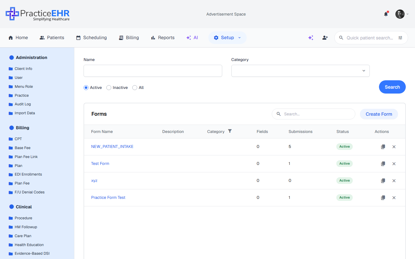
Drag-and-drop form designer built into Practice EHR. Create patient intake, consent, survey, and screening forms with 28 components across Frequent, Basic, Identity, Choice/Survey, and Layout categories — and collect responses through a built-in submissions inbox.
Landing page for the Form Builder under Setup → Clinical → Form Builder.
Filter by name, category (Intake, Consent, Survey, Screening), and active status before searching.
Each row shows the field count so you can gauge complexity at a glance.
Click a form name to open it in the 3-tab editor (Details / Build / Submissions).
Inline search in the card header filters rows in real time.
Field reference
Click to expand
Filter bar4
NameInput
Type all or part of the form name.
CategoryDropdown
Nine options: Patient, Provider, Insurance, Pharmacy, Intake, Consent, Survey, Screening, or Registration.
StatusRadios
Define the form's availability: Active (default) or Inactive. Select All to see both.
SearchButton
Applies all filters and refreshes the table.
Card header3
TitleLabel
Reads "Forms".
Inline searchInput
Filters visible rows as you type.
Create FormButton
Opens the 2-step wizard. Step 1 collects metadata; Step 2 opens the drag-and-drop builder.
Table columns6
Form NameLink
Click to open the form in the 3-tab editor.
DescriptionText
Internal team notes (never shown to patients).
CategoryPill
Type of form. Filter icon on the column header allows inline filtering.
FieldsNumber
Total number of fields in the form.
StatusPill
Indicates if the form is Active (green) and available for use, or Inactive (gray) and archived.
ActionsIcons
Copy = duplicate; X = delete (asks to confirm).
Footer2
Result countText
"Showing 1 to N of M results".
Page controlsButtons
Previous, page numbers, Next, plus a Refresh icon.
Where to find it
Top nav → Setup → sidebar group Clinical → Form Builder.
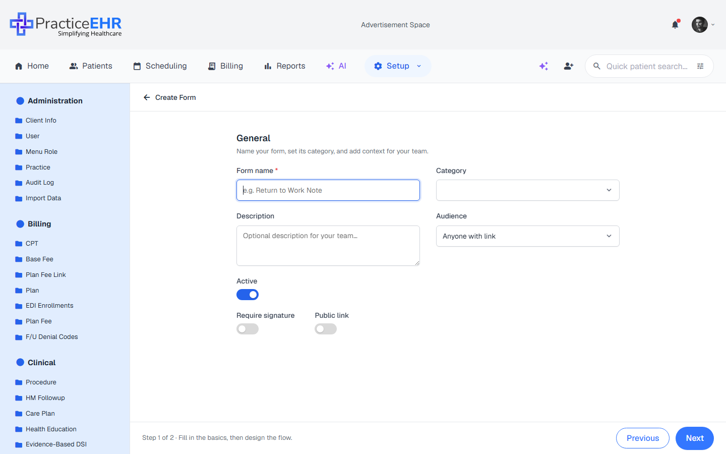
Create Form
2-step wizard · Setup → Clinical → Form Builder
1
Details
Capture the form's metadata before building. Only the form name is required — everything else can be filled in later from the Details tab.
General4
Form nameRequired
Display name in the grid and at the top of the editor. Placeholder: "e.g. Return to Work Note". Example: "Patient Intake Form".
CategoryDropdown
Nine options: Patient, Provider, Insurance, Pharmacy, Intake, Consent, Survey, Screening, or Registration.
DescriptionTextarea
Optional internal notes for your team. Placeholder: "Optional description for your team…"
AudienceDropdown
Who can fill out the form: Anyone with link (default), Patient, Provider, or Staff.
Toggles3
ActiveToggle (default ON)
Controls form status. When ON, status is Active and visible in the grid. When OFF, status becomes Inactive and hidden (archived).
Require signatureToggle
Adds a mandatory signature field to the bottom of the form.
Public linkToggle
When on, anyone with the URL can submit the form without logging in — useful for new patient intake.
Footer3
Step indicatorHint
Reads "Step 1 of 2 · Fill in the basics, then design the flow." so users know what comes next.
PreviousButton (disabled)
Disabled on Step 1; becomes active on Step 2 to return to the metadata form.
NextButton
Validates that Form name is filled, then advances to the Build canvas. Disabled until a name is entered.
2
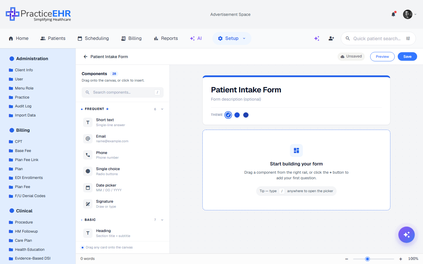
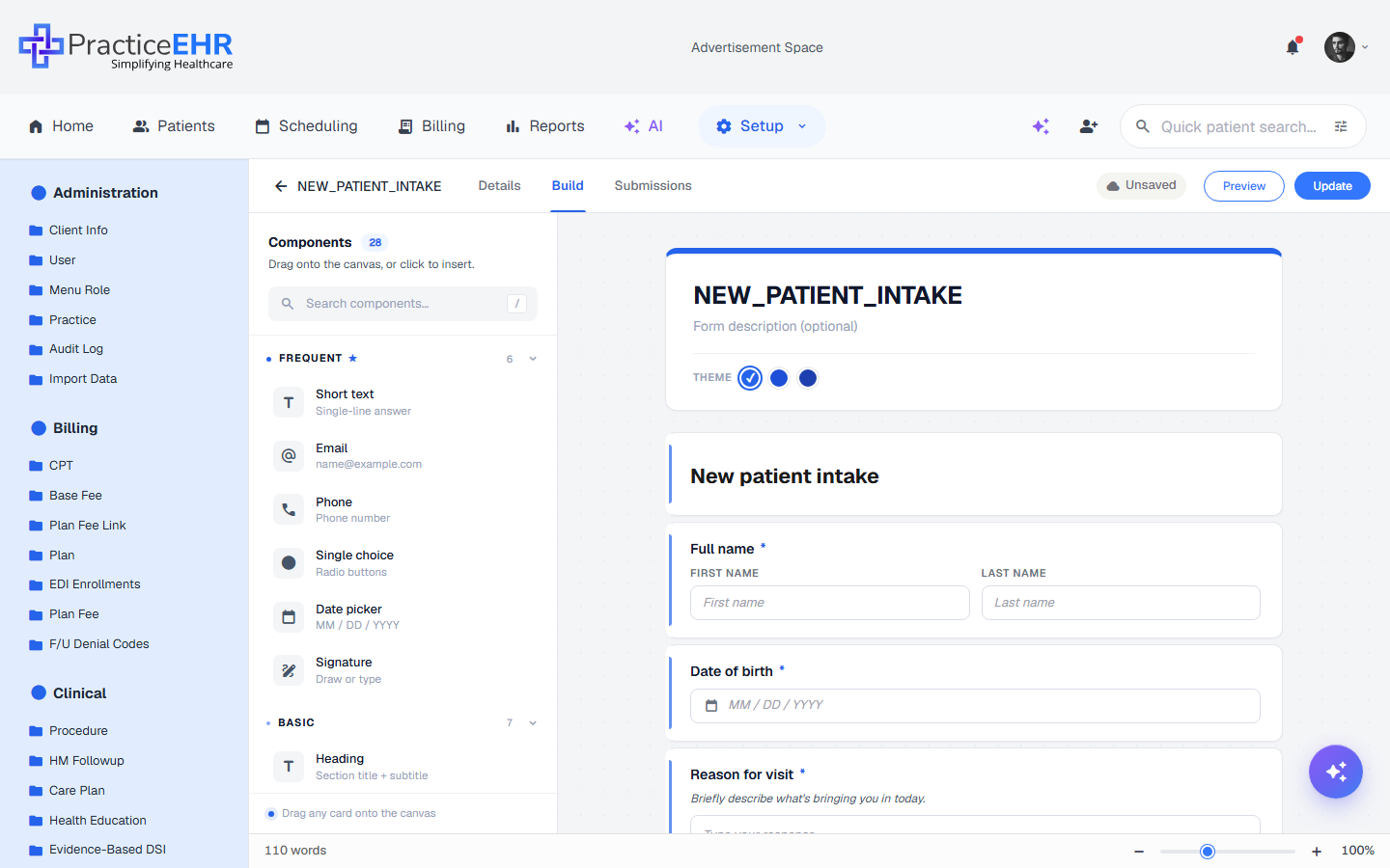
Build
A drag-and-drop form designer with 28 components grouped into Frequent, Basic, Identity, Choice / Survey, and Layout & Special. Drop a component onto the canvas, then click any field to set its label, options, or required state. Use Preview to test before publishing.
Three regions. The builder is split into a left Components palette, a center canvas, and a right Field settings panel that opens when you click a field on the canvas.
Top bar4
Back arrowAction
Saves and returns to the Forms grid.
Save statusIndicator
Shows the current persistence state of your work:
Unsaved: Changes have been made but not yet committed to the database. A cloud icon with a slash or "Unsaved" text appears.
Saving...: An active background process is currently uploading your changes.
Saved: All changes are securely stored. A solid cloud checkmark icon confirms your work is safe.
PreviewOutline button
Opens the Preview & Share modal. Use this to test validation, field requirements, and the final layout in a live, interactive environment before sharing the link with patients.
SaveButton
Manually triggers a full save of the form structure, field settings, and metadata. It's best practice to click this before exiting the builder.
Components palette (Left)28
Panel headerLabel
Reads "Components" with a blue count badge (28) and the helper line "Drag onto the canvas, or click to insert."
Search componentsInput
Quickly find a specific field by typing its name (e.g., "Address"). The / shortcut focuses this search from anywhere on the canvas.
FREQUENT ★ 6
Six shortcut tiles for the most-used fields (these duplicate items from other groups):
Short text: Single-line alphanumeric answer.
Email: Validates for correct email format.
Phone: Formatted for telephone numbers.
Single choice: Radio buttons (pick one).
Date picker: Interactive calendar (MM / DD / YYYY).
Signature: Touch/mouse drawing pad for digital signatures.
BASIC 7
Heading: Structural title + subtitle text.
Paragraph: Static helper text or instructions.
Short text: Single-line alphanumeric answer.
Long text: Multi-line text area for notes/comments.
Fill in the blank: Sentence-style input with an inline blank.
Number: Numeric-only input.
Spinner: Number input with +/− buttons.
IDENTITY 8
Full name: Combined First + Last name fields.
Email: Validates email format (e.g., name@example.com).
Phone: Formatted for telephone numbers.
Address: Multi-line physical address block (street, city, zip).
Date picker: Interactive calendar (MM / DD / YYYY).
Time: Clock-based selection (HH : MM).
Appointment: Combined date + time picker for scheduling.
Birth date: Specialized date field for DOB.
CHOICE / SURVEY 8
Dropdown: Space-saving single selection list.
Single choice: Radio buttons (pick one).
Multiple choice: Checkboxes (select one or more).
Yes / No: Two-pill binary choice.
Star rating: 1–5 visual star feedback.
1–10 scale: Linear NPS-style scale.
Input table: Grid for multiple questions with shared options.
Signature: Touch/mouse drawing pad for digital signatures.
LAYOUT & SPECIAL 5
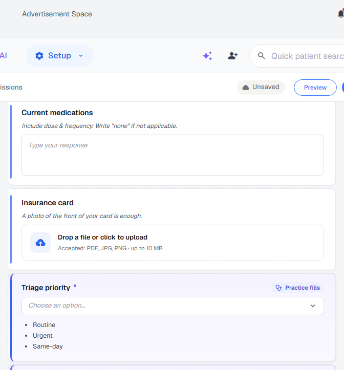
File upload: Patients can attach documents or images (up to 10 MB).
Image: Static image block — useful for logos, diagrams, or instructions.
Divider: Horizontal separator that groups related fields.
Page break: Splits the form into multiple pages for easier navigation.
Captcha: Anti-spam bot-check field.
Canvas (center)5
Form headerEditable
Form title and optional description shown to patients above the first field.
Theme pickerSwatches
Three color swatches in the form header set the accent color used for the title bar, primary buttons, and required-field markers. The selected swatch shows a check.
Field cardsCards
Each added field is a card with its label and a drag handle. Click to select; drag to change the position of each card inside the form to reorder them. Selecting a field reveals a floating side-actions toolbar on its right edge — see below.
Empty stateHint
When the canvas is empty, a "Start building your form" message appears with quick instructions and a / shortcut tip.
Status barFooter
A thin footer along the bottom of the canvas shows a live word count on the left and a zoom slider (−/+ with a percentage readout) on the right.
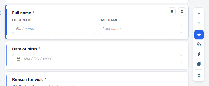
Side-actions toolbar (selected field)7
Click any field card on the canvas to reveal a vertical toolbar pinned to its right edge. Each icon shows a tooltip on hover. Active states (e.g. required ON, practice fills ON) light up in blue.
Move up / downChevrons
Two stacked arrows reorder the selected field within the form — an alternative to drag-and-drop.
RequiredAsterisk
Toggles the required flag. When ON, a red * appears next to the label and the field must be filled before the form can be submitted.
Practice fills thisStethoscope
Toggles the field's audience. When ON, the field is hidden from patients and only the practice can fill it — a Practice fills badge appears in the header and the field becomes part of the Task Form rather than the patient-facing form.
Rules / logicZap
Opens conditional-logic rules for the field — show / hide / require based on the value of another field. Lights up when the field already has at least one rule.
DuplicateCopy
Inserts an identical copy of the field directly below the original.
DeleteTrash
Removes the field from the canvas. Asks to confirm before deleting.
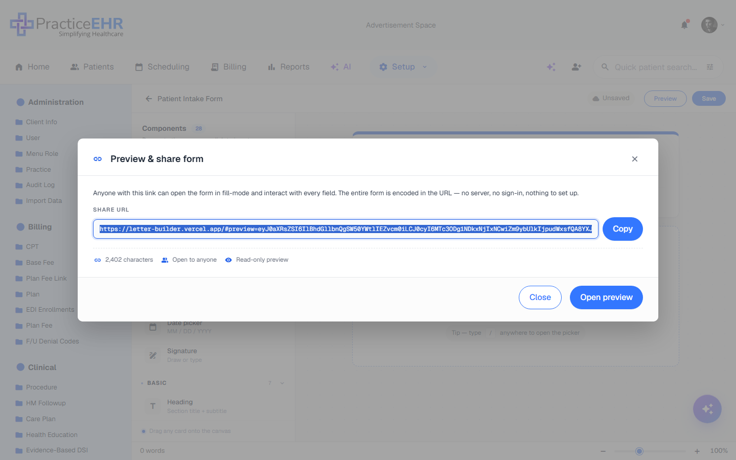
Always test before publishing. Preview opens a sharable read-only view of the form, with all validation, required markers, and the submit button. Submitting from preview does not create a real submission record.
Preview & share modal5
TitleLabel
Reads "Preview & share form".
DescriptionNote
Explains that the entire form is encoded in the URL — no server, no sign-in, nothing to set up. Anyone with the link can fill it.
Share URLRead-only input
The full URL with form data baked into the hash. Use Copy to send to a patient.
Stats rowMetadata
URL character count, audience badge, and read-only indicator.
Open previewButton
Opens the form in a new tab in fill-mode so you can interact with every field exactly as a patient would.
Form Details
Editing existing form · Setup → Clinical → Form Builder
Clicking an existing form from the grid opens it in edit mode. The 2-step stepper from creation is replaced by three free-navigation tabs — Details, Build, and Submissions — so you can switch back and forth at any time.
Rules / logic panel — empty stateRule with condition — When & Then sections
Three regions. When editing an existing form, the builder remains split into the Components palette, the canvas, and the Field settings panel.
Top bar4
Back arrow + form nameAction
Saves and returns to the Forms grid. The current form name (e.g. NEW_PATIENT_INTAKE) sits next to the arrow for quick context.
Save statusIndicator
Shows the current persistence state of your work:
Unsaved: Changes have been made but not yet committed to the database.
Saving...: An active background process is currently uploading your changes.
Saved: All changes are securely stored. A solid cloud checkmark icon confirms your work is safe.
PreviewOutline button
Opens the Preview & Share modal to test validation and layout.
UpdateButton
Manually triggers a full save of the form structure and settings. (Labeled Save while creating a new form, and Update once the form already exists.)
Components palette (Left)28
Panel headerLabel
Reads "Components" with a blue count badge (28) and the helper line "Drag onto the canvas, or click to insert."
Search componentsInput
Quickly find a specific field by typing its name. Press / from anywhere on the canvas to jump here.
FREQUENT ★ 6
Six shortcut tiles for the most-used fields (these duplicate items from other groups):
Short text: Single-line alphanumeric answer.
Email: Validates for correct email format.
Phone: Formatted for telephone numbers.
Single choice: Radio buttons (pick one).
Date picker: Interactive calendar (MM / DD / YYYY).
Signature: Touch/mouse drawing pad for digital signatures.
BASIC 7
Heading: Structural title + subtitle text.
Paragraph: Static helper text or instructions.
Short text: Single-line alphanumeric answer.
Long text: Multi-line text area for notes/comments.
Fill in the blank: Sentence-style input with an inline blank.
Number: Numeric-only input.
Spinner: Number input with +/− buttons.
IDENTITY 8
Full name: Combined First + Last name fields.
Email: Validates email format.
Phone: Formatted for telephone numbers.
Address: Multi-line physical address block.
Date picker: Interactive calendar (MM / DD / YYYY).
Time: Clock-based selection.
Appointment: Date + time picker for scheduling.
Birth date: Specialized date field for DOB.
CHOICE / SURVEY 8
Dropdown: Space-saving single selection list.
Single choice: Radio buttons (pick one).
Multiple choice: Checkboxes (select one or more).
Yes / No: Two-pill binary choice.
Star rating: 1–5 visual star feedback.
1–10 scale: Linear NPS-style scale.
Input table: Grid for multiple questions with shared options.
Signature: Touch/mouse drawing pad for digital signatures.
LAYOUT & SPECIAL 5
File upload: Patients can attach documents or images (up to 10 MB).
Image: Static image block — useful for logos, diagrams, or instructions.
Divider: Horizontal separator that groups related fields.
Page break: Splits the form into multiple pages.
Captcha: Anti-spam bot-check field.
Canvas (center)4
Form headerEditable
Shows the saved form name and an optional description. Click to edit either inline.
Theme pickerSwatches
Three color swatches in the form header set the accent color used for the title bar, primary buttons, and required-field markers.
Field cardsCards
Each added field appears as a card on the canvas. Click to select; drag to change the position of each card inside the form to reorder them. Selecting a field reveals a floating side-actions toolbar on its right edge — see below.
Status barFooter
A thin footer along the bottom shows a live word count on the left and a zoom slider (−/+ with a percentage readout) on the right.
Side-actions toolbar (selected field)7
Click any field card on the canvas to reveal a vertical toolbar pinned to its right edge. Each icon shows a tooltip on hover. Active states (e.g. required ON, practice fills ON) light up in blue. See the side-actions screenshot.
Move up / downChevrons
Two stacked arrows reorder the selected field within the form — an alternative to drag-and-drop.
RequiredAsterisk
Toggles the required flag. When ON, a red * appears next to the label and the field must be filled before the form can be submitted.
Practice fills thisStethoscope
Toggles the field's audience between patient and practice. When ON, the card gets a purple tint with a Practice fills badge next to the label — see the practice-fills screenshot. The field is then hidden from patients and shows up in the Task Form instead.
Rules / logicZap
Opens a Rules side panel scoped to the selected field (see the rules-panel screenshot). From there you can show, hide, or require the field based on answers to other questions. The panel header reads "Rules / For 'Field name'", with an empty state and an Add rule / Done footer. The icon lights up blue once the field has at least one rule attached.
DuplicateCopy
Inserts an identical copy of the field directly below the original.
DeleteTrash
Removes the field from the canvas. Asks to confirm before deleting.
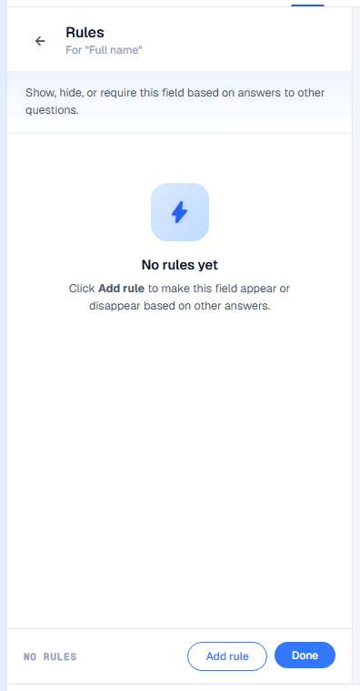
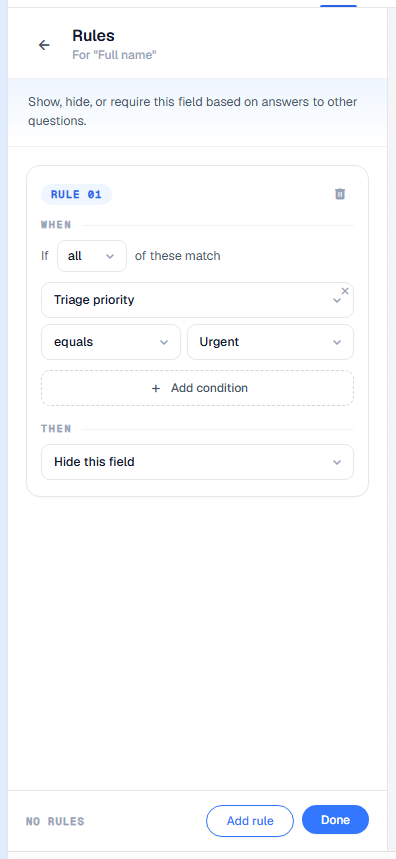
Rules / logic panel4
HeaderTitle
Reads "Rules" with a sub-line "For 'Field name'", plus a back arrow that closes the panel without losing the selection.
Intro lineHint
Explains the panel's purpose: "Show, hide, or require this field based on answers to other questions."
Empty stateHint
When no rules exist, a centered zap icon, the No rules yet headline, and a hint to click Add rule are shown.
FooterButtons
Left side shows the rule count (e.g. NO RULES). Right side: Add rule (outline) appends a new condition card; Done (primary) commits the rule set and closes the panel.
Rule card — When & Then5
Each click of Add rule appends a numbered card (RULE 01, RULE 02, …). A rule has a WHEN section that combines one or more conditions, and a THEN section that picks the action to apply.
Rule headerLabel + Trash
Zero-padded rule number on the left, trash icon on the right to remove the entire rule.
Combinatorall / any
Reads "If all of these match" or "If any of these match". Switches between AND and OR across all condition rows in the card.
Condition rowField · Op · Value
Three controls plus a delete ×:
Source field — any other question in the form that can be evaluated (text, dropdown, radio, checkbox, yes/no, rating, etc.).
Operator — one of is filled, is empty, equals, does not equal, contains, does not contain.
Value — automatically becomes a dropdown of the source field's choices when the source has discrete options (e.g. Urgent from Triage priority's options), or a free-text input otherwise. Hidden for is filled / is empty.
Add conditionOutline button
Adds another condition row to the same rule so several questions can be combined via the all/any combinator.
Then actionAction
What happens to the selected field when the WHEN conditions match: Show this field, Hide this field, or Make required.
Practice-fills field appearance3
Card backgroundTint
Practice-fills field cards have a soft purple background, distinguishing them visually from the white patient-fills cards on the same canvas.
Practice fills badgePill
A small pill with a stethoscope icon and the text Practice fills sits to the right of the field label.
Patient visibilityHidden
The field is removed from the public/patient-facing form entirely; patients submitting via the share link never see it. It only surfaces inside the practice Task Form when staff open the task.
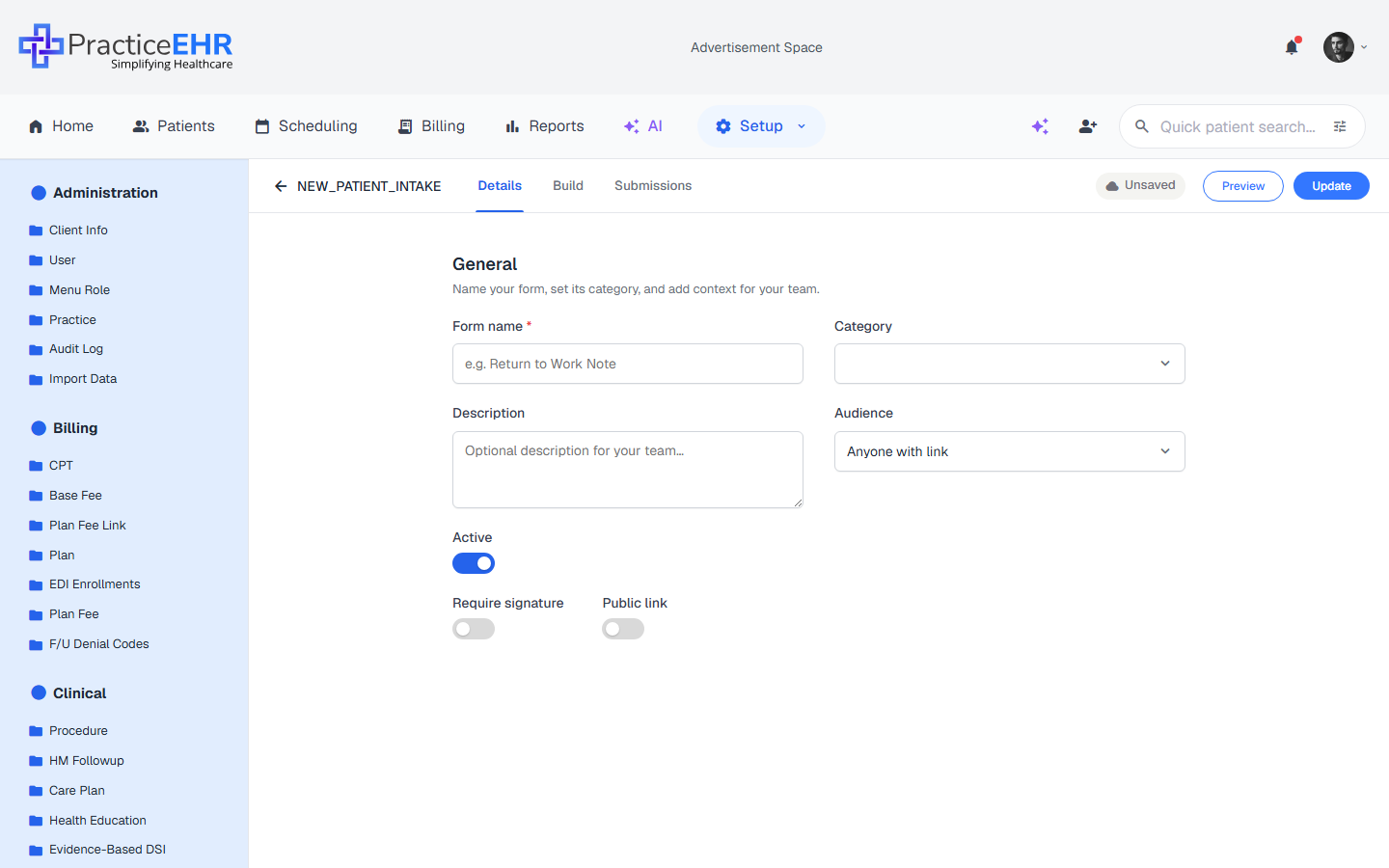
The Details tab
Same metadata form as Step 1 — Details when creating, but pre-filled with saved values.
Edit form name, category, description, audience, or any toggle without leaving the editor.
Changes save when you hit Save in the top bar — the same button used on the Build tab.
Where it appears. When editing an existing form the create-flow stepper is replaced by free-navigation tabs (Details / Build / Submissions) so you can move between metadata, structure, and responses freely.
General fields4
Form nameRequired
Display name in the grid and editor.
CategoryDropdown
Nine options: Patient, Provider, Insurance, Pharmacy, Intake, Consent, Survey, Screening, or Registration.
DescriptionTextarea
Optional internal notes for your team.
AudienceDropdown
Who can fill out the form: Anyone with link (default), Patient, Provider, or Staff.
Toggles3
ActiveToggle
Sets form status. Toggle OFF to make the form Inactive and archive it; toggle ON to keep it Active and visible.
Require signatureToggle
Adds a mandatory signature field.
Public linkToggle
Anyone with the URL can submit without logging in.
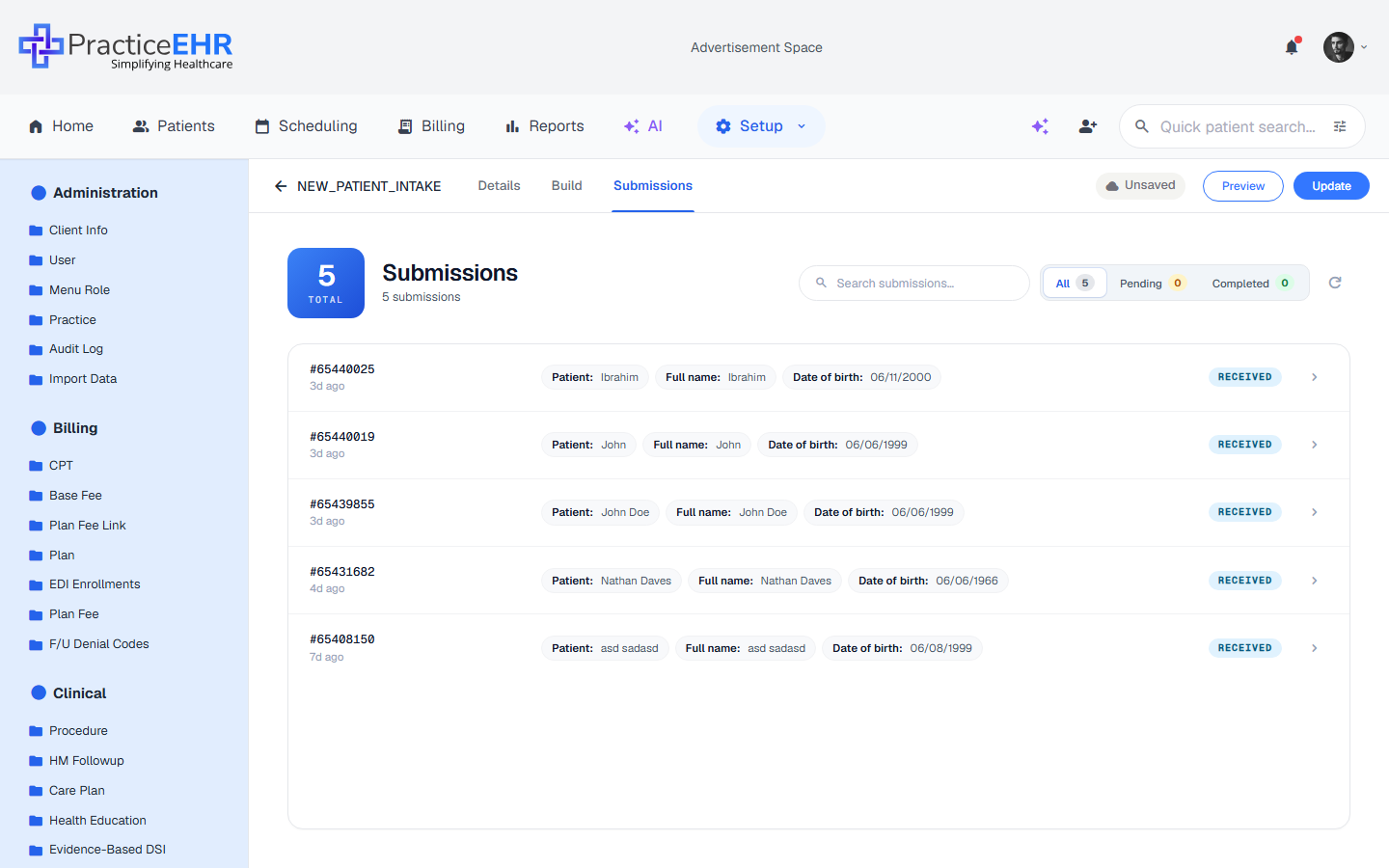
Submissions — live inbox
The Submissions tab only appears when editing an existing form.
Every patient or staff response shows up here with a unique submission ID and timestamp.
The big TOTAL card and the "N submissions" subtitle update in real time as new responses arrive.
Click any row to view the full filled-in form for that submission.
Header4
Total cardStat
Big blue card with the live submission count and a TOTAL label.
TitleLabel
Reads "Submissions", with a subtitle showing the total (e.g. "5 submissions").
SearchInput
Filter submissions by ID or any field value.
Status filterPills
Three counted pills: All (default), Pending, and Completed. Each pill shows the matching submission count next to its label.
Submission rows4
Submission IDAuto
Auto-generated unique ID like #65440025.
Time agoRelative
When the response came in (3d ago, 9h ago, just now, etc.).
Field preview chipsPills
First few fields with their values (e.g. Patient: Ibrahim · Full name: Ibrahim · Date of birth: 06/11/2000). +N more chip when there are more fields.
Status pillPill
Blue Received for new submissions awaiting review. Click the chevron at the row end to open the full submission detail.
Empty state1
No submissions yetEmpty
When a brand-new form has no submissions, the inbox shows a "Save the form first / Submissions appear here once your form is saved" message with a Copy share link button.
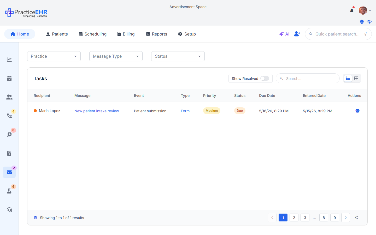
Task Form
Home > Tasks · Form submission
When a patient submits a form, a task lands in the practice work queue on the Home tab. The full Tasks grid (filters, columns, pagination) is documented in the Home section — this page focuses on the Task Form that staff use to review and complete a form-driven task.
Where it comes from — Home > Tasks queue
Clicking the blue check_circle action on a Form-type task row opens the Task Form modal below. See the Home docs for the full grid (filters, columns, pagination).
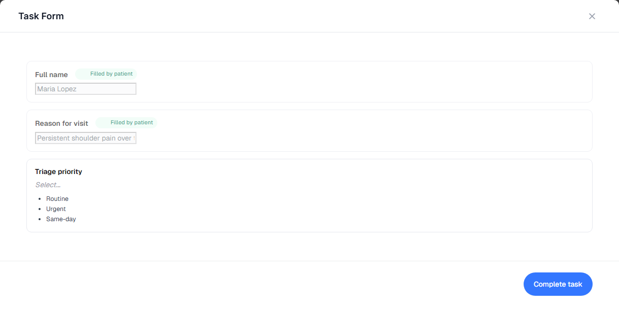
Task Form modal
Task Form
Opens as a modal when staff click the check_circle action on a task row — in the screenshot, the task for Maria Lopez.
Patient-completed answers appear as read-only fields with a green Filled by patient badge.
Only the fields still pending at the practice end remain editable.
Depending on the form setup, staff can complete practice-side fields such as triage priority, signature, or provider assignment.
Header2
Task Form titleLabel
The modal heading reads "Task Form".
Close (×)Icon
Closes the modal without saving and returns to the task grid with the current filters intact.
Body — two field groups2
Patient-filled fieldsLocked
Every field the patient already answered shows up here with a green Filled by patient badge. The values are read-only — staff cannot edit them, they're shown only for context while completing the task.
Practice-pending fieldsEditable
Any field flagged as Practice fills this in the builder appears here as an editable control. The exact set varies per form (triage priority, provider assignment, signature, internal notes, etc.). Required practice fields must be filled before Complete task becomes available.
Completion1
Complete taskButton
Marks the task complete after all required practice-side fields are finished. The task then appears in the grid when Show Resolved is enabled.